Andstudio . shared a beautiful branding and visual design project for Ignitis, an international energy group, uniting over 20 companies and operating across the Baltics, Poland and Finland. It turned to us for a brand identity that would stand the test of time and unite all of the company’s ventures under a cohesive brand.
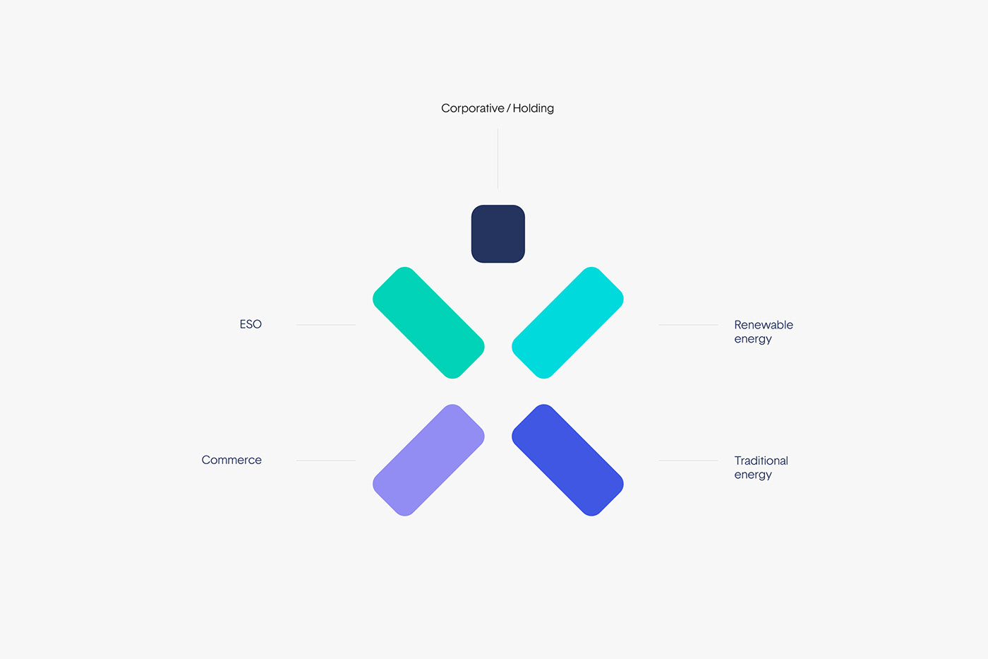
Aiming to become the region’s main competence center for energy solutions, Ignitis needed its new brand to reflect its progressive agenda. For this, we created an identity system that consists of five building blocks, each representing a major business unit, with a foundational Holding symbol at the top. Put together, they form a human-like shape, embodying the company’s client-centric approach. Color coded modules visually highlight separate business units, which can be successfully used in classical and digital communication, both as a system as well as separate dynamic portals.
Branding and Visual Identity
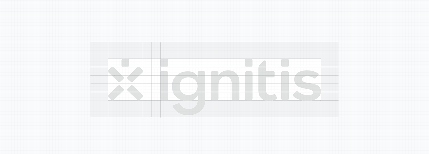
Logotype
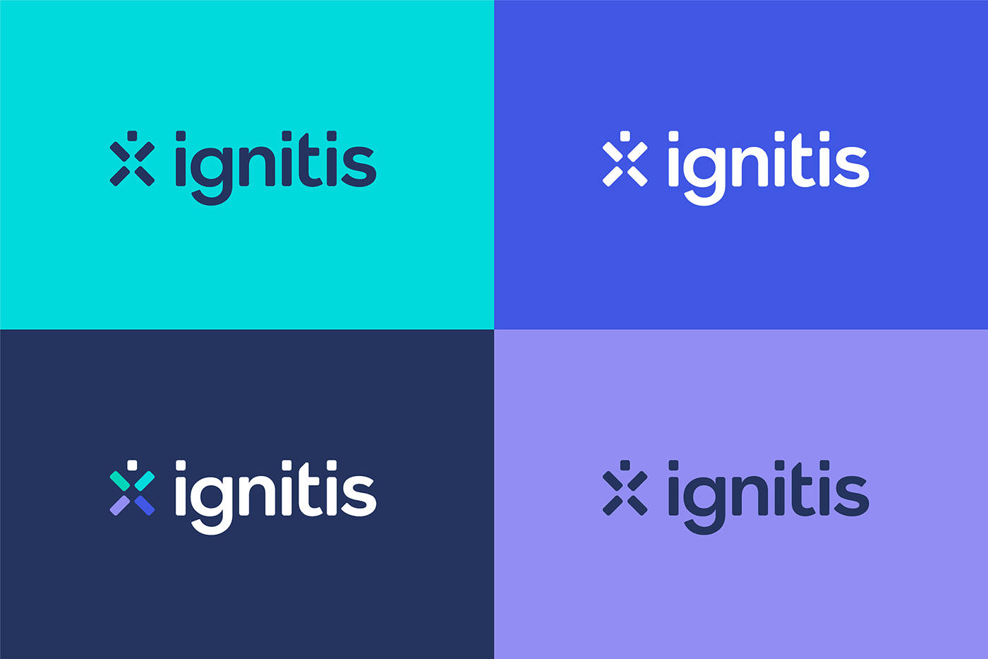
Our logotype represents a stylized human shape as a visual anchor. Shapes and colours express adaptability to customers needs and a consumer-centric approach. At the same time it aims to represent a spark – symbol of versatility and innovation.

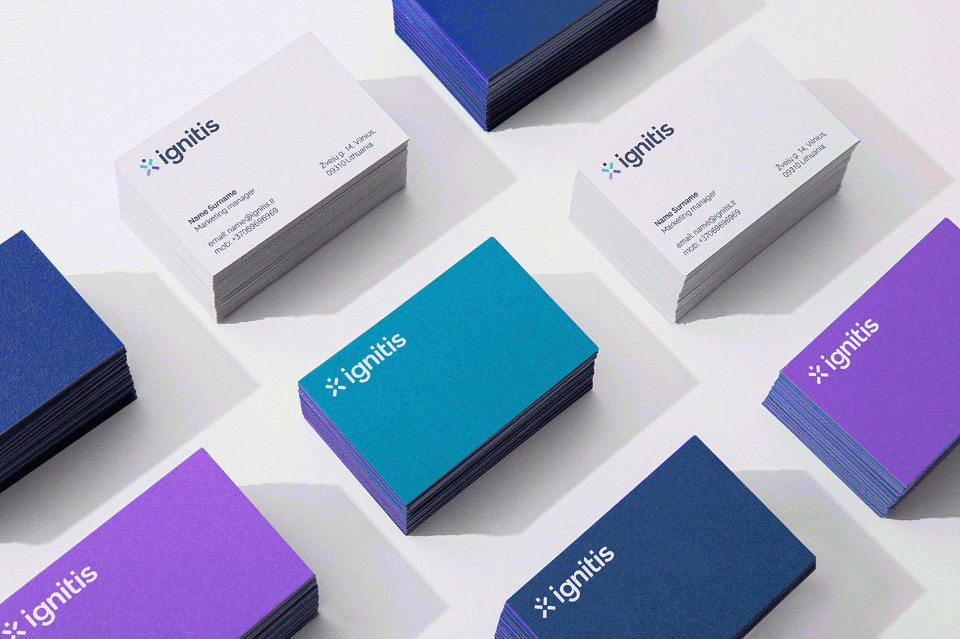
Identity
To fully broadcast the message, the brand uses graphic element that supports the principles already established by the logo. The graphic components are embracing moments of both clear structure and visual impact, leading with a solid color palette, mixing headlines with color-blocked shapes and icons. The whole identity system is based on Ignitis’ expertise, trust, versatility and innovation.
Digital Identity System
Investing into a visual identity should have a return for years to come. That’s why we create identity systems that can be adapted to different formats and marketing materials or even extended to cover new business ventures or side projects when a brand expands.