Every month we present a roundup of the trends we expect to see in the weeks ahead.
Each of the design trends we are spotting this month have to deal with over-the-top techniques. It’s interesting because these big effects don’t always pop on the radar of what’s trending, but these concepts almost begged to be featured with a large number of projects showcasing these design elements.
This type of trend is interested because designers either love them or hate them. Take a look and see if these are concepts you’ll use. Here’s what’s trending in design this month.
Exaggerated White Space
So much white space.
These websites feature exaggerated amounts of whitespace and strong minimal themes with very little color or design ornamentation. And if you are like me, you can’t stop looking at them.
How does a design with so little visual information work?
The design trick here is disruption. If you see one of these designs, they are vastly different than almost any other site you are visiting. That makes you stop, and look, and think about what you are seeing. With the right content it can be quite effective.
While each of the designs here use exaggerated amounts of white space and practically no color, they don’t all look the same and use complementary effects to get a message across.
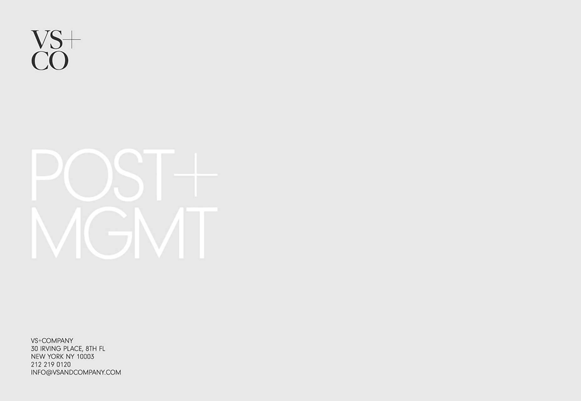
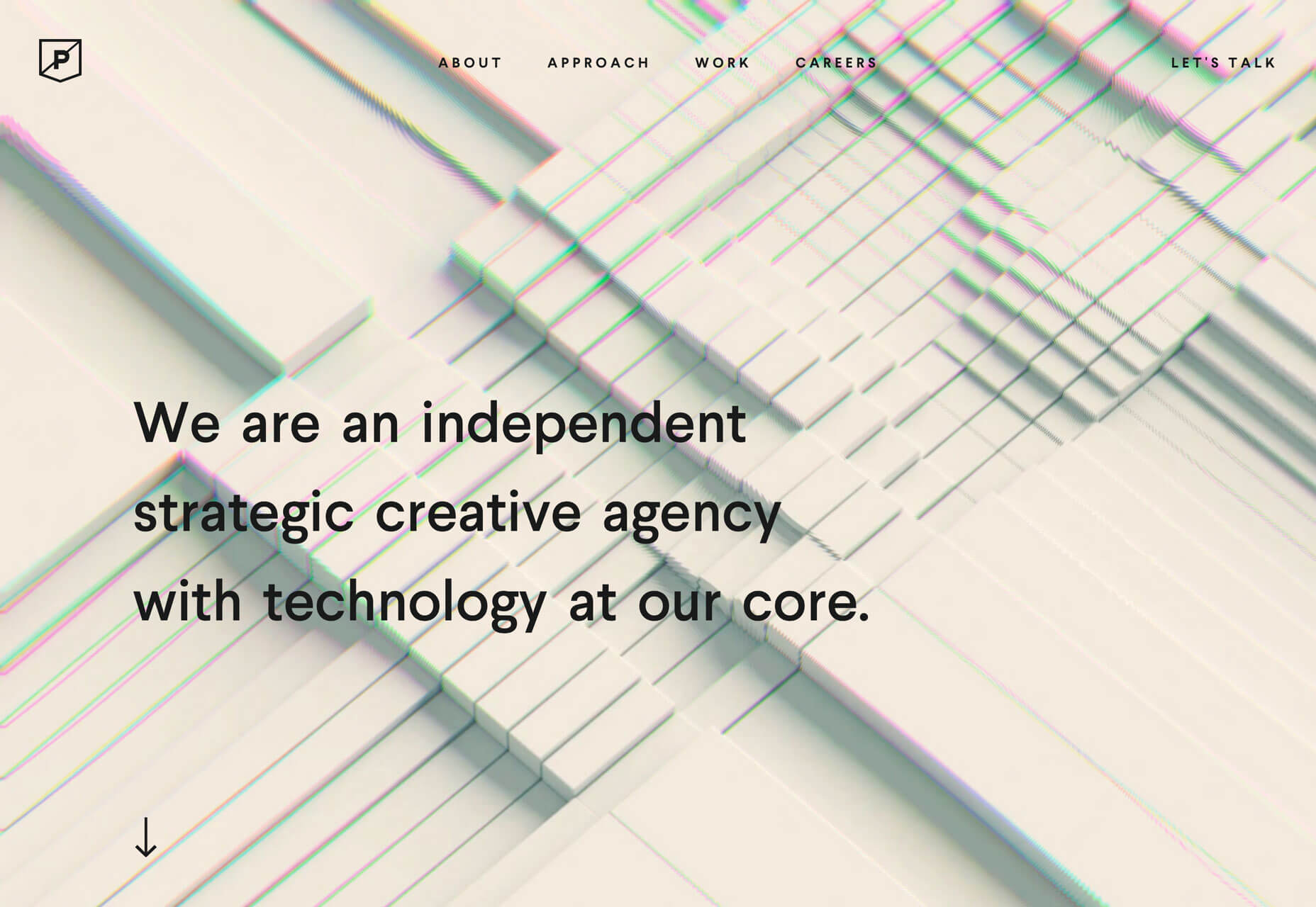
VS+Company uses a subtle animation with text blocks that appear next to the oversized “POST” and “MGMT” lines. The text provides additional content and information about the website and uses a black color that makes it easy to read.
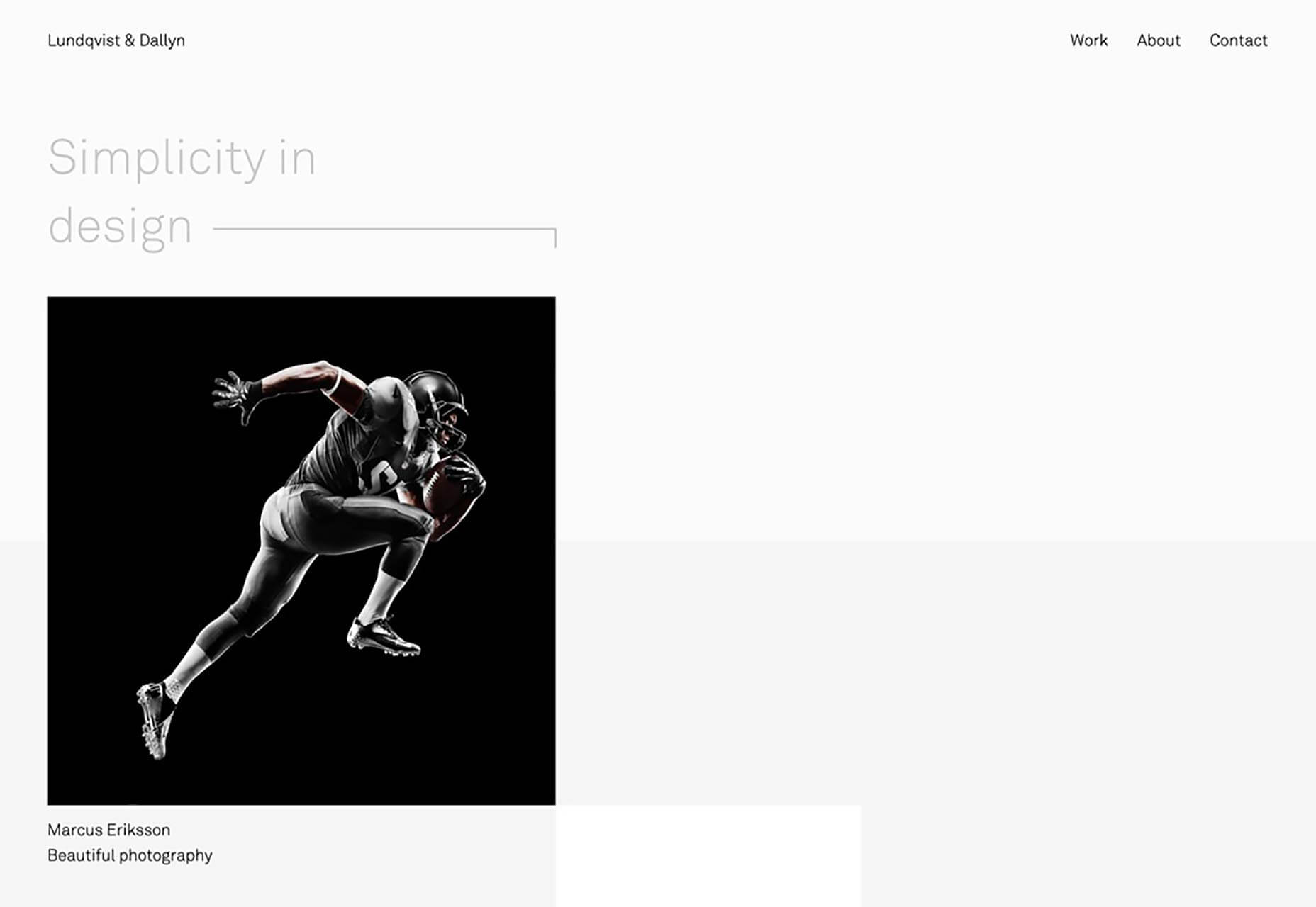
Lundqvist & Dallyn asks a question to pique user interest. The image on the home screen and throughout the scroll feature hover animations that encourage clicks.
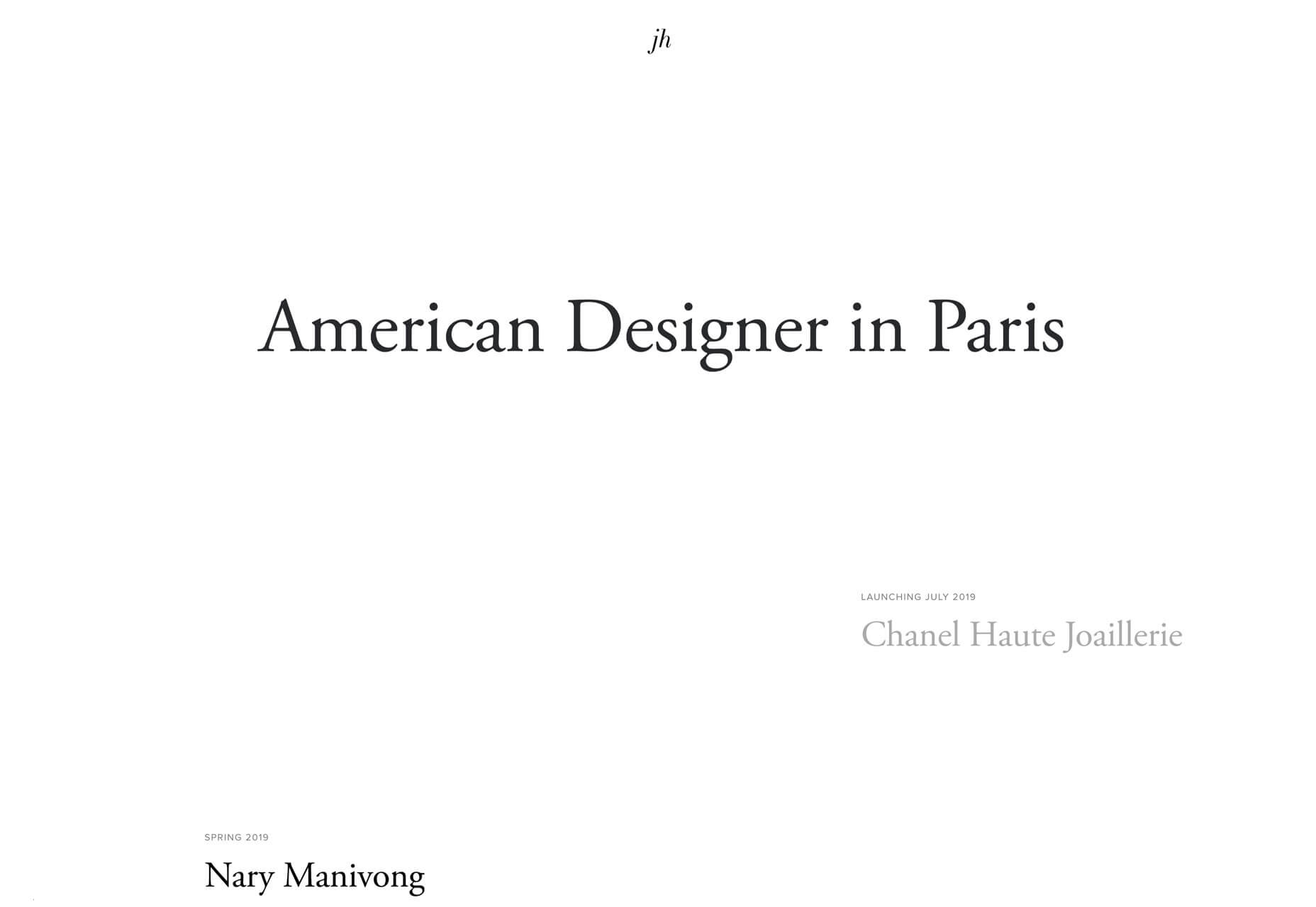
Jillian Hobbs uses white space to help users hone in on the words – in this case project names – to interact with. It’s a risky concept for a design portfolio, but it did encourage clicking through to pages with the same visual pattern, but featuring images and color.
Sharp Edges and Lines
While brutalism has never fully taken off as a widespread design trend, it is influencing designers. Sharp edges and lines are one way that we’re seeing it manifest.
Most recently, projects have had a softer feel with gradient coloring, real images or illustrations, and softer shapes. The projects below feature more hard edges, thick lines and square shapes. These shapes can be paired with different elements to establish a feel. The result is a design trend that’s a little harder, stronger, and harsh. It almost demands that you look at it.
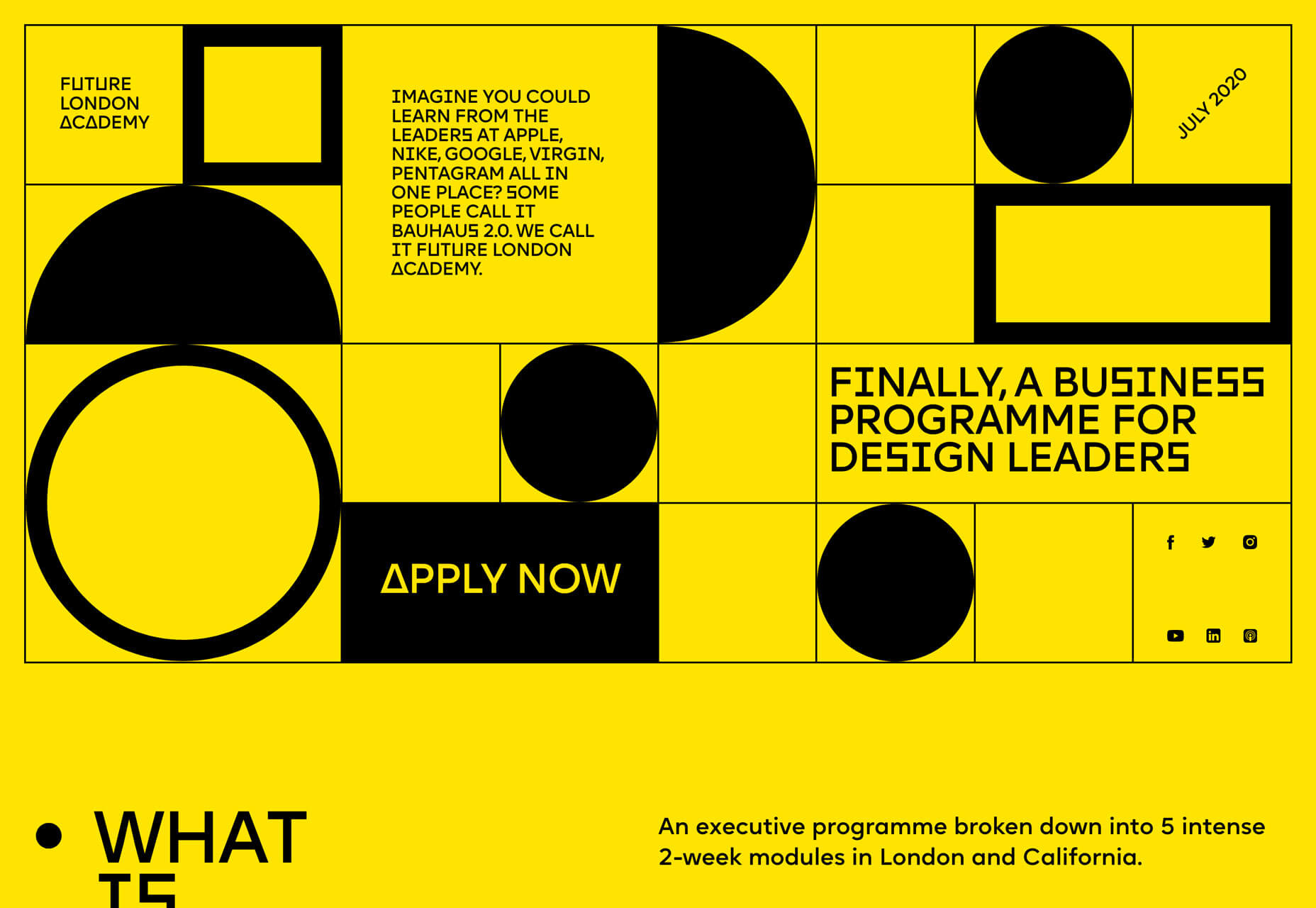
Future London Academy uses bold yellow and black to create the most brutalist feel of the collection. Even the typography has an edge to it.
Purple Rock Scissors has an animated twitch to the hard lines on its homepage, which creates a feeling of unease for users. Why is everything twitching and moving in this way? It almost forces you to scroll. All of the video clips on the site use the same effect, which feels a lot like what we are seeing with the TikTok social network.
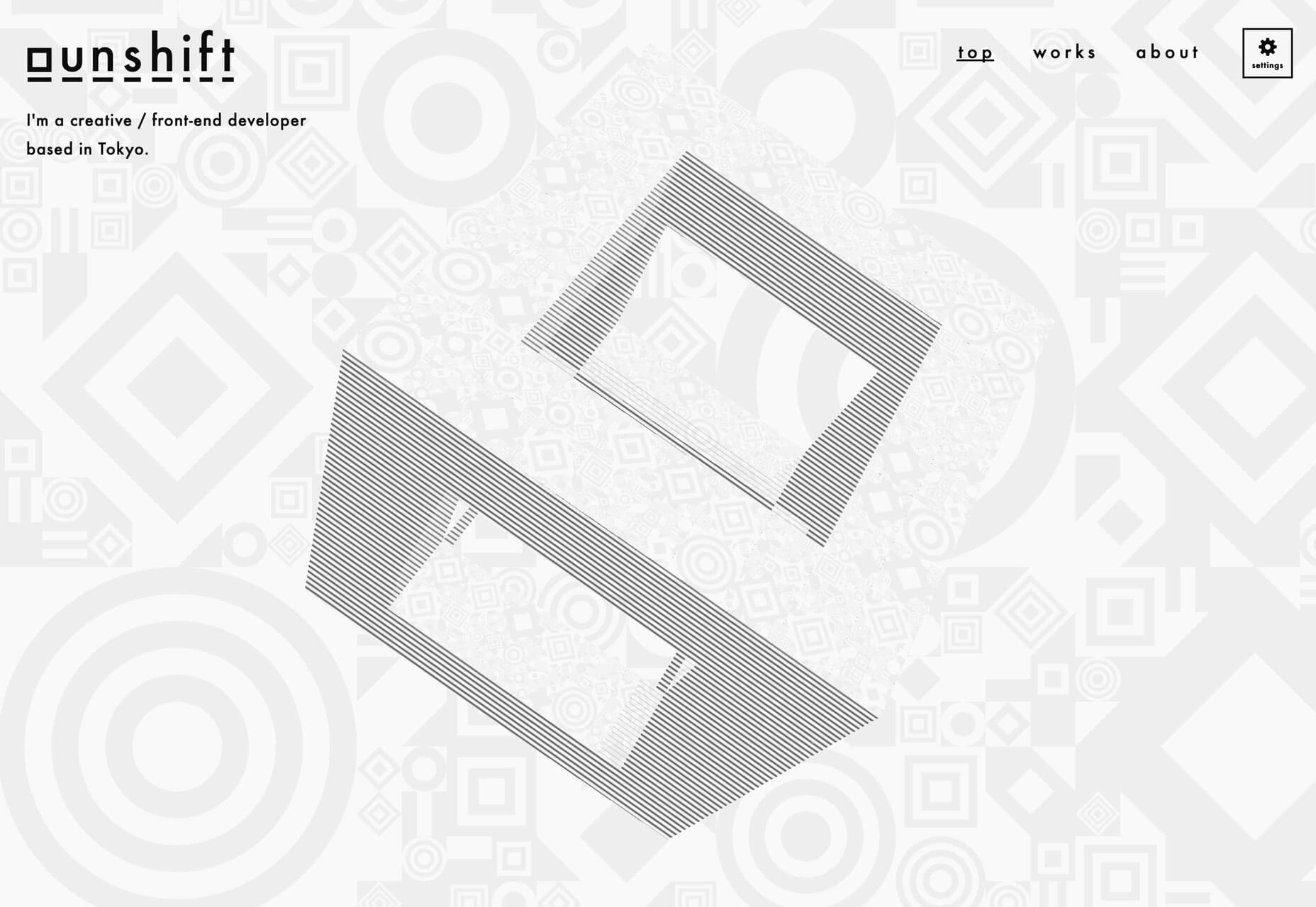
The Unshift portfolio focuses on shapes and animation with almost no color to draw users in. The moving cube is intriguing and enough to generate interest.
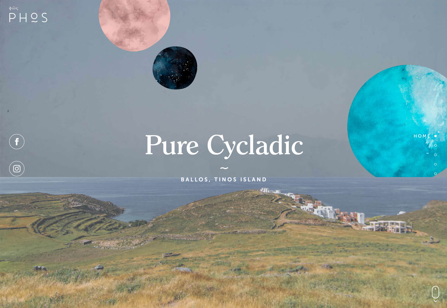
Screen-Centered Headlines
Hero headlines aren’t a new trend at all. But have you noticed a shift in the placements of the big text on homepages?
It’s vertically and horizontally centered.
The placement makes sense when you think about it. The eye will go right to the middle of the screen and then spread out to other elements. But do you love the super symmetrical feel?
The other benefit to this design technique is for the mobile versions of websites. It fits just a nicely on a mobile screen as desktop. Conversely if the text is positioned strong to the left or right, it often has to be moved when you shift from a more horizontal to vertical screen orientation.
This is one of those neat trends that’s heavily influenced by technology and how we use and interact with devices online.
The only thing to be aware of with a trend like this is that while perfect symmetry is harmonious and visually appealing it might not work with all backgrounds or imagery. It can also start to seem somewhat boring if everyone does it.
Finally, think about the length of words and messaging. With too many characters this style can feel heavy and overwhelming and works best with short blocks of text, such as each of the featured examples below.
Conclusion
When it comes to over-the-top design ideas, what works for you, do you prefer color, space, or typography? While you can see some influences of these trends on each other, what makes them work is that the focus is on one strong design element.
Love these ideas or hate them, each project above has a design style that encourages users to take a second look and consider engaging with the design.


