WCAG (web content accessibility guidelines) was created by the world wide web consortium (W3C) and is the most recognised standard globally for accessibility.
In this article we outline the tasks required for performing an audit to verify compliance with WCAG 2.1 standard.
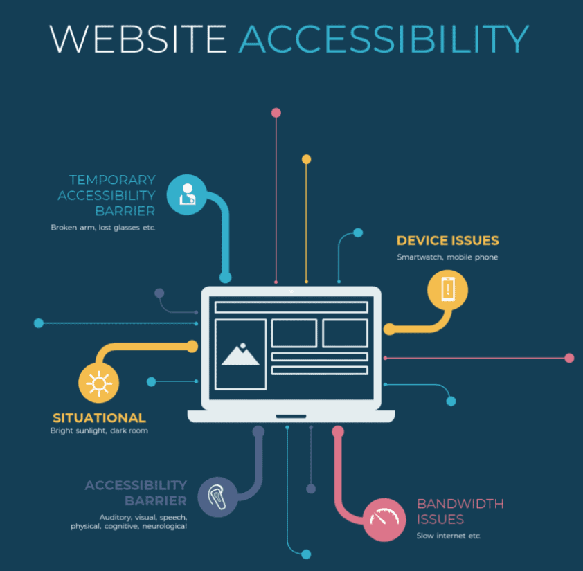
Accessibility is about ensuring your website content and functionality can be accessed by a wider audience.
For example:
- Temporary accessibility barrier – Someone has lost their glasses!
- Device issues – They are on a device that is restrictive e.g. mobile phone
- Situational – Bright sunlight, dark room etc
- Permanent disability – No sight, no hearing, cognitive issues etc.
- Bandwidth issues – A very slow connection
As you can see there are many forms of disability that you need to consider.
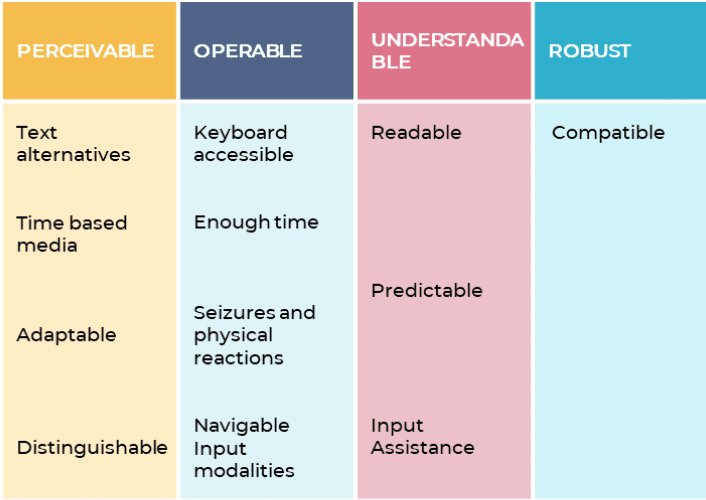
The WCAG guidelines is broken down into the following:
Before going through each section here’s a list of what you’ll need to perform testing:
1. Perceivable
- A selection of browsers including text only (e.g. Lynx)
- A tool for checking alt tags, headings etc (e.g. ScreamingFrog)
- A screen reader such as NVDA
- A website accessibility test tool
- Chrome development tools
- Access to a selection of devices
This is about making sure that content is accessible in various forms. For example, someone can see the content, listen to it, use touch to understand the content etc. This also includes user interface items such as menus and buttons.
The WAVE accessibility tool is one of many tools that can be used to find issues in this area:

In the above example the page does quite well. It only has 1 error and 5 errors with colour contrast issues.
The one error is that this page doesn’t indicate the language.
But there are lots of good things on the page. For example, in the image on the right where you see 2 elements highlighted in green, these both use the ‘ARIA’ labels to help a screen reader understand this content. Later on we’ll explain more about this.
Let’s go through the guidelines and the success criteria.
Guideline 1.1 -Providing text alternatives to non text content
Are there text alternatives to non text content?
When you have non text content on a screen you need to verify that there are descriptions for each of those elements.
Before we give examples I want to discuss ARIA which is a way of providing additional descriptions to elements and should only be used when standard HTML is not possible.
When you use HTML you automatically get keybord control, focus etc. and that is the preference but ARIA can be used as a backup.
What is ARIA?
ARIA (accessible rich internet applications) is a way of describing content that cannot be described sufficiently using standard HTML. It’s main purpose is for screen readers. If you can use standard HTML then that is the best approach because it will automatically provide focus to the element and keyboard control. When this is not possible ARIA is the alternative.
Descriptive Images
A descriptive image is something that portrays something of meaning. For example, a picture of a Toyota Prius car.
If you cannot see the picture then there needs to be a way of describing what this picture represents which is where an Alt tag comes in.
In platforms such as WordPress you can add the alt tag when uploading the image:

Quite often we update this alt tag to make sure relevant keywords are included for SEO purposes but we need to go beyond this.
Screaming frog will do an analysis of all images on your website and display which images have no alt tags, duplicate alt tags, alt tags that are too long or alt tags that are too short!
You can see the images alongside the details of the image also:

Decorative image
A decorative image is an image that is there to enhance the design but there’s nothing in the image worth describing!
Decorative images should use the CSS background property unless there’s a good reason to use the ‘img’ tag. If a screen reader sees the CSS background property it knows to ignore the image.
Here’s an example of an image described as a background image in My Emergency Doctor website in Australia:
Here’s the code behind this:


Because this image is not listed as it uses the role=img to let screen readers know this is an image. It uses the ‘Aria-label’ to give a good accurate description of the image. It also defines the image as ‘background-image’.
Note: If you use the ‘img’ tag for a background image you need to define a null alt tag e.g. alt=” “
When should you use instead of background-colour?
When an image is an important part of the content then use . For example, if you have a product image then this is
. You could also have images which are just background images used for decoration purposes and it doesn’t make sense to describe these as images (which will be indexed by Google).
In the example above you could question if the image displayed should be defined as img but it’s a stock photograph and they decided to define it as a background image instead which is ok.
Note: is a HTML tag but background-image is a CSS style that you use.
UI Controls
There are various UI controls that require some text to describe what it is.
For example, a button or form control.
A button is used to help complete a function. It could be a button that only has an icon and one that has text in the button. Both could be handled differently.
Using ARIA you can define ‘role=button’ but with standard HTML you can use the
Here’s an example of a button which just has an X in it that requires us to create an ‘aria-label’ to describe what the button does.
Here’s a list of typical UI controls that you’ll need to test:
| Category | Example |
|---|---|
| Input controls | Checkbox, radio button, lists, buttons, text fields, date field. |
| Navigation components | Menu, tabs, breadcrumb, slider, icons, pagination, tags, icon, search field, carousel |
| Informational components | Progress bar, tooltips, notifications, message boxes, modal window (popup), |
| Containers | Accordion |
If you are using forms you need to make sure that each field is labeled correctly. Here’s an example of good labeling:
Note: for forms you should also ensure:
- Clearly mark mandatory fields. If a field is mandatory then it will also need to be labeled correctly in the html.
- There are instructions for the user (usually at the top of the form)
- Users get help when they make an error completing a form field (e.g. incorrect date format, this is what you need to enter).
Captcha
This can be very problematic depending on how it is implemented. For example, when pictures are shown and you are asked to identify which picture contains traffic lights!
We’ll review the implementation and make relevant suggestions.
Multimedia content
Video/Audio needs at least a description to identify what the video/audio is about.
Links
You want to make sure that links clearly stand out on the page (e.g. different colour) and that they use relevant anchor text and link description.
Guideline 1.2 – Time based media
This area is about catering for video and audio content that needs to be made more accessible.
Is there transcription available for pre-recorded audio only or video only?
Video transcription is the translation of your video’s audio into text. Transcription does not include audio information that describes things like visuals displayed in the video. This is handled separately.
Transcription tip!
Rev.com is a great service for creating captions/transcription for your audio/video. They even provide a live captioning service for Zoom video.
Are there captions available for pre-recorded audio?
Caption is a text that appears within the video to inform the user about what the person is saying.

Is there an audio description or media alternative (pre-recorded)?
When you are watching a video the captions may not be sufficient to describe what is shown within the video. This is where audio description is also required.
For example, an audio description could describe what’s happening in the background when someone is speaking so it gives users some context.
Here’s an example of transcription which includes audio description.

This is great for your website visitor but it’s also good for SEO!
Tip on selecting an accessible player:
You want to make sure the video player you use supports what is required for accessibility:
- Supports closed captions
- Audio description can be be toggled on/off
- Keyword control can be used on the media player
- Media player works on different devices and browsers
- All controls are accessible.
Are there captions for live audio?
You generally won’t have any live video or audio content on your website but if you did then you’d need to have simultaneous caption creation so users see the captions displayed as the person speaks.
There are tools available to automatically caption your live video and audio.
Is there audio description for pre-recorded synchronized media?
This is for media that contains video and audio. We want audio information which accompanies the media.
Guideline 1.3 – Adaptable – Present information in a format that can be understood by software.
You need to ensure that what you can interpret visually by looking at something is programmatically described so that it can be interpreted correctly by software like screen readers.
Is there a logical structure to the content and is it is easy to understand the relationship with each piece of content within that structure?
When you view a web page you normally see headings, paragraphs, bolded content, tables etc. And when you view details of a table you see headings and you clearly see which row is relevant to which heading.
Here’s what you’ll need to review:
- Is content broken up into sub headings?
- Are lists, tables etc. used when appropriate?
- Is there correct HTML used for other structural elements throughout the content?
- Are there labels and alt text used as required (e.g. on forms?)
Tip
A good starting point is to test your website using a validator tool that checks for valid html (e.g. W3.org html validator).
Here’s an example of a form which displays required fields in red. This is ok for a visual user, but what about someone using a braille display?
To get over this problem the word ‘required’ is also added to the label for last name which is a required field.
Is there a content order that make sense?
- When you view a web page you’ll see a navigation bar, then some content, headings, sub headings, paragraphs of text. You want to make sure this is presented in an order that makes sense.
- Use heading styles to indicate the importance of sections. You typically only have one
style to identify the page of content and then you might have multiple H2, H3 etc.
- Have the navigation separate from the content (e.g. define navigation using
- Use valid html
Here’s a typical structure of headings that make sense:

Can users understand the content when they can’t perceive shape, size or use information about spatial shape or size?
The easiest way to explain this is with an example:
Let’s say you have a comparison table of software product features and when a product has a feature then a diamond image is displayed in this column. This is not sufficient, you’ll need to add text to indicate what this diamond represents.
Does the website work well in portrait and landscape mode?
The website needs to be able to adapt to portrait or landscape mode without losing meaning.
If a website has implemented responsive design correctly then when you change orientation it adapts to a different viewport (i.e. selects a more suitable display based on the screen dimensions).
Are inputs to forms described correctly?
The purpose of this is to ensure that programmatically there is enough information about any field that needs to be completed in a form.
And if it’s possible enable auto fill so that the user doesn’t have to complete everything!
Can the purpose of elements on a page be figured out programmatically?
An example of this is using the ARIA ‘role’ element for sections of a website.
For example, a banner containing logo/company name etc. could be described as ‘role=banner’.
or using input labels on forms for email, name, address etc.
This is how you’d see this in HTML:
Is there a text version of any graph?
If there’s any graph type content you’ll want to have a table which summarizes what this content is about.
Guideline 1.4 – See and hear content
This is about making it easy for people to see and hear the content.
Are there text alternatives when colour is used to convey information?
Imagine you had a form and and a required field was displayed in red.
This doesn’t mean much to a screen reader!
But you could add the word ‘required’ onto the table as in the example below:
Is there a mechanism to pause or stop the audio if it plays for more than 3 seconds?
If you are using a screen reader and a video automatically plays at the same time you’ll hear two voices!
Ideally, there will be no auto play of video which solves this issue.
If there is an auto play then make sure it’s less than 3 seconds and if it’s not, then make sure there’s a way to control the audio of the video playing.
Is there a good contrast between text and images/colour in the background?
We all know how important colours are in design and branding, but for the visually impaired visitors to your site, colours won’t make much of a difference to their experience.
For example, colour blind people won’t see a difference between red, orange, yellow, and green and you need to cater to them, too.
The key here is to be mindful of contrast ratio which is one of the most common accessibility issues found on websites.
Is there sufficient contrast between text colour and its background? A tool like colour contrast checker can help you find out!

The background colour is on the left and then the text colour is on the right. The score is in the middle.
The recommendation is that the contrast is at least 4.5:1 or 3.1 when the text is large (e.g. 18 point or 14 point bold).
Also, make sure to use tools other than colour to communicate important content and information on your site.
For example, your main CTA usually pops out on the page due to a colour that makes users notice it. To make CTAs more accessible, you can use size, placement, boldness, contrast, to make them noticeable for people with colour blindness.
Can text be made larger and your website still function as normal?
An obvious one is just enlarging text on a screen to help someone with a visual impairment.
But you want the website to function as normal if a user increases the text size.
For example, when a user zooms in the text up to 400% you need to make sure that no information is lost.
Here’s an image from W3.org. I’m sure you don’t want your website to look like the one on the right when you enlarge text.

The WCAG 2.1 requirement is that you should be able to enlarge by 200% without any issues.
Are images of text avoided unless necessary?
You might have a logo which contains text (e.g. your company name) which is ok.
But what about images of text?
If you have an image of text you have to, at least, provide a label which describes it.
But you’re better off avoiding this type of images unless:
- It’s essential
- It’s customisable
Is the website responsive?
It’s normal to scroll down to see the full web page but not to scroll to the right or left.
When you move from a desktop to a smaller device the screen should automatically adjust so that you still don’t have to scroll to the right or left.
Is there sufficient contrast for non text content?
Adjacent colours need to have a contrast ratio of at least 3:1
This requirement is for people with relatively low vision.
Can spacing/line height be adjusted without any loss of performance?
- Line height (line spacing) should be at least 1.5 times the font size;
- Spacing following paragraphs should be at least 2 times the font size;
- Letter spacing (tracking) should be at least 0.12 times the font size;
- Word spacing should be at least 0.16 times the font size.
Is content displayed correctly on hover or focus?
When you focus on an element (e.g. tab to it) or hover over it you see additional content.
For example, you hover over a button and a popup appears.
…or a sub menu is displayed.
This content needs to be:
Dismissable – For example, if you click Escape the content is not displayed any more.
Hoverable – When you hover over the content the content is displayed as long as the mouse is over the trigger.
Persistent – This is a combination of both. The content remains visible until the user dismisses it, the user moves the mouse away or the content no longer contains important information.
Note: This does not apply to when a HTML element such as a title is displayed when you hover over something (e.g. an image).
Is the font readable?
Some font/typefaces are more readable that others. There is preference towards serif or sans serif but that is not mandatory. They key part is that it’s readable.
2. Operable
This means users need to be able to use the navigation and the user interface by interacting with it. For example, they can ‘operate’ the user interface using the keyboard.
Guideline 2.1 – Keyboard accessible
Many users use a keyboard instead of a mouse or trackpad, including users with mobility accessibility barriers or those using a screen reader.
This is why all functionality on your website must be accessible via keyboard – links, buttons, forms, and other controls.
Is everything accessible via a keyboard?
Now is the time to stop using your mouse and use your keyboard only.
You’re checking:
Does everything follow a logical order going forward or backwards (using tab to go forward and shift tab to go back).
When you are on a particular button, section etc. do you see that this element is highlighted? In the following example, it’s obvious we’ve tabbed to ‘articles’.

Is everything accessible using the tab key and when you press enter when you have focus does it activate the action?
Note: If a popup appears you need to be able to navigate this also.
Can you skip the header?
When you are using a screen reader you don’t want it to read out the same header on every page. That would drive you insane. So you should be able to tab to the ‘Skip to content link,’ press enter and then your next tab will skip that section.
When you click tab when you first arrive on the website below, you are on the ‘Skip to content’ link. If you press enter you go straight to the content.
If you press a second tab you move to the ‘Skip to navigation’ link. If you press enter on this you are brought to the navigation.

If you press tab again you move to ‘skip to navigation’. If you select this you jump directly to navigation.
If there’s a character, punctuation, number or symbol used as a shortcut there must be a way to disable or change this shortcut to one or more non printable characters. The only other exception is when the shortcut is only available when the element has focus.
2.1.2 Are there any situations where you hit a dead end with the keybord (a keyboard trap)?
You tab your way to a place on the website and you can’t tab forward or backwards.
This is known as a keyboard trap. As the song goes…caught in a trap, can’t look back….
Is there an alternative to a keyboard shortcut implemented using a letter?
Having a character key shortcut with someone that relies on a keyboard for navigation is not good because they may end up pressing it by mistake.
So we need to provide an alternative.
a) Ability to remap this character to another shortcut
b). Turn it off
c). It’s only active when you have focus on this. So that means if you use the shortcut nothing happens unless you are actually on it!
Guideline 2.2 – Enough time
Imagine if you set a time limit on completing a form but only considered users without accessibility needs. This time limit may be too short.
Is timing adjustable?
Switching off the timing is ideal, but being able to extend it (i.e. when the time limit is nearly reached) or adjust it to the new time is ok.
Can the website user pause, stop or hide moving, blinking or auto updating content?
If it’s moving/blinking or scolling and it:
a). starts automatically
b). lasts more than 5 seconds
c). is presented in parallel with other content
Then there’s a mechanism for pause, stop or delete.
Same issue with auto updating content.
Guideline 2.3 – Seizures and physical reactions
This guideline is to make sure that nothing is designed that could cause a seizure or physical reaction.
Do ‘flashes’ on the screen meet the guidelines?
Rule number one is avoid any flashing objects but if that is not possible then make sure it doesn’t flash more than 3 times in any one second or flash below the general or red flash thresholds.
Guideline 2.4 – Navigable
This is about making it easy to navigate through the website.
Can you skip over repeating blocks?
Imagine using a screen reader and every time it gets to a new page it reads out the navigation. Now that wouldn’t be fun. So you need to be able to skip these. I gave an example of this earlier.
Are all pages titled correctly?
You need good descriptive titles on all pages. This is good for accessibility but also good for SEO.
You can use Screaming Frog to look at page titles all in one place:

Does the focus order preserve meaning?
If you are tabbing through the content but you tab in an order that doesn’t make sense you’ll need to fix this.
Can you determine the purpose of the link from the link text?
‘Click here’ is not a very helpful anchor text. You need to have words that describe the content that the link is going to.
What is anchor text?
When you are linking to another page on your website or an external website the anchor text is the visible text you see that is related to the page you are sending people to. Instead of just showing the link it’s better to show the actual text.
Is there more than one way to locate a web page?
Here are some examples:
- Sitemap – Have a list of all pages on a sitemap
- Quick links – Have quick links to get to important pages
- Search – Search to find a relevant page

Is keyboard focus visible?
The question says it all! This was also covered in one of the earlier guidelines. When you tab to somewhere you need to be able to visually see the focus is in that area.
Are header, body and footer clearly defined?
Assistive technologies need to be able to clearly identify header, footer and body. There are html tags which define these areas.
Guideline 2.5 Input modalities
This guideline is about newer interfaces where you may not use a keyboard or mouse to navigate. For example on smartphones you can swipe, pinch and zoom, tap etc.
Can functionality using multipoint or path based gestures be operated by a single pointer without using the gesture (unless essential)?
A path based gesture is where you need to move in specific path. For example, you swipe up to access certain functionality or down to access other. A multi-point gesture is where you use two or more points of contact to access functionality e.g. use 2 fingers to pinch and zoom.
Is there an easy way to get out of an action that has been initiated by a single pointer?
What’s a single pointer?
This is where you can access functionality with one point of interaction with a screen e.g. tap, click, long press etc.
At least one of the following must be true:
- No down event – the trigger is implemented when you press down on a button
- Abort or Undo – You use an up event (i.e. function is enabled when the pointer is released) and there’s a way of aborting. For example, you are pressing on something with your finger and instead of lifting your finger up straight you slide it to another part of the screen and the functionality is aborted.
- Up reversal – The up event reverses the down event
- Essential – Completing the function of the down event is essential.
Does the visible label of a component match the programmatic name of that component?
If a sighted user uses text to speech the programmatic name will be read out and it’s a better experience if this matches the visible label.
Can functionality that is operated by motion or gesturing also be operated by other UI controls?
If you shake or tilt something to control it can you use another UI control to access this functionality?
Understandable
This is about making sure the language used on the page is understandable.
3.1 Readable
We cover the following:
Can the language of the page or sections of the page be programmatically determined?
You should see something like this at the start of any page. ‘Lang’ indicates the language of the page.
If the language changes on the page you’ll need to be able to identify this also.
3.2 Predictable
You want your UI to perform in a predictable way, no surprises!
Is navigation in the same order on pages?
The navigation position on one page should be the same on all other pages unless the user makes a change to the navigation.
Are components, images etc. named consistently across pages?
If you have an image on one page and have the same image on another page then you want the image to be named the same.
If you have several pages of a post and you name the pages page 1, page 2, page 3 that is consistent. Labeling does not have to be the same if it doesn’t make sense but it does have to be consistent.
3.3 Input Assistance
This is about helping users avoid or recover from mistakes:
Input error – If you’re typing in something incorrectly you might visually see it’s wrong but there also needs to be text identifying the issue.
Labels – When users have to enter a text there is an associated label describing the field.
Input error – If a user makes an error then there is a suggestion on how to fix it.
Error prevention – You should be able to either reverse, get some feedback about the error or have the ability to confirm before you submit.
4. Robust
In addition to being accessible, your content needs to support a variety of browsers, technologies etc.
Guideline 4.1 Compatible
This involves testing with a variety of user agents and assistive technologies. A good initial test for this is using the W3C markup validation tool to see if there are any errors (i.e. it validates that the structure/syntax of html, xhml etc is correct).
Here’s an example of the output:

Also you need to test against multiple browsers to make sure content is loaded correctly.
And it’s also worth loading the page in a text only browser (such as Lynx).
Can all the data be parsed correctly?
Is there proper start and end tags within sections of the content so it’s easy to identify where a section starts and ends?
Are elements nested correctly?
Are there duplicate attributes or id’s that make it hard to distinguish elements?
Can all user interface controls be understood by assistive technologies?
Here are some examples of controls and what you need to be able to figure out:
- Checkbox – is it checked or not?
- Focus – What element has focus and can this be programmatically understood (not just visually)?
Are users made aware of status messages that are not given focus in a way that doesn’t necessarily interrupt work?
Imagine if you were browsing a page and while on that page a banner came across the top of the website announcing a sale.
Are forms designed in the right way?
To make forms accessible, you’ll want to ensure that the following is enabled:
- Ability to use tab to navigate through the form
- Ability to use tab to navigate through the form
- Clearly marked mandatory fields. If a field is mandatory then it will also need to be labeled correctly in the html.
- There are instructions for the user (usually at the top of the form)
- Users get help when they make an error completing a form field (e.g. incorrect date format, this is what you need to enter).
Summary
As you can see, there’s a lot to of ground to cover when running a comprehensive accessibility audit. However, it all pays off and the benefits it brings to your business are many – from building a positive brand image to reaching a broader audience and improving your SEO.


