


The smartphone is the starting point for most online experiences. For many businesses, the majority of visitors arrive on a phone, not a desktop monitor. That single fact has reshaped how websites should be planned, designed, and built.
Mobile-first design is the approach that meets this reality. Instead of treating the mobile site as a smaller version of the desktop experience, it starts with the smallest screen and works outward. When done well, it delivers a faster, cleaner, and more useful experience for the people who matter most to your business.
What Is Mobile-First Design?
Mobile-first design is an approach that embraces the constraints of smaller screens and focuses on what is indispensable for users to improve the overall mobile user experience. In practice, it means starting the design process by prioritizing the smallest screens and progressively enhancing for larger devices such as tablets and desktops.
It is also a development philosophy. You create the mobile version of your website or application before designing for desktop. Mobile-first web design is a strategy where developers design the mobile version of a site first, then scale it up for larger screens. The desktop layout is not abandoned. It is built on top of a mobile foundation that already works.
This reversal of the traditional process changes how teams think about content, navigation, and performance from the very first step.
Why Mobile-First Web Design Matters in 2026
Businesses are investing more in mobile-first website design in 2026 because most users now browse websites primarily through smartphones. The mobile experience is no longer a secondary version of the site. For many visitors, it is the only version they ever see.
Over 60% of Global Web Traffic Is Mobile
With over 60% of global web traffic coming from mobile devices, designing for the desktop first is a critical mistake. Mobile-first design ensures your site performs flawlessly where the majority of your users are. When you design the mobile experience before the desktop experience, you make sure the most common visit to your site is also the best one.
Google Indexes the Mobile Version of Your Site
Google now indexes the mobile version of every site for search rankings. The version of your site that Google uses to evaluate and rank your pages is the mobile version. A mobile-first approach therefore affects both user experience and discoverability. If the mobile experience is weak, your search visibility can be held back even if the desktop site looks strong.
User Expectations on Small Screens Have Grown
People no longer accept a mobile site that feels like an afterthought. They expect clear navigation, readable text, and fast loading on their phones. Mobile-first design focuses on what is indispensable for users and removes anything that gets in the way. The result is a focused experience on the device people use most.
How Mobile-First Design Changes the Way You Build
The order of the design process matters. In a desktop-first workflow, teams create a spacious layout and then try to squeeze it into a phone. In a mobile-first workflow, teams start with the smallest screen and progressively enhance for larger devices.
That shift forces better decisions. Navigation must be simplified. Content must be prioritized. Performance must be considered early, because mobile users feel slow load times immediately. The principles, best practices, and examples from mobile-first projects all point to the same outcome: a rewarding user experience on every screen.
The Core Principles of Mobile-First Design
Mobile-first design is built on a few straightforward principles that guide every decision.
Start With the Smallest Screen
You begin the design process by prioritizing the smallest screens. This forces you to make decisions about layout, content, and priority before you have the extra space that larger screens provide. What works on a small screen usually works on a big screen. The reverse is not always true.
Focus on What Is Indispensable
Small screens do not have room for everything. Mobile-first design forces you to ask what is truly necessary for the user. Secondary features, decorative elements, and supporting content can be added later. The core message, the main actions, and the primary navigation must be clear from the start.
Use Progressive Enhancement for Larger Devices
Once the mobile experience is solid, you enhance the design for larger screens. Tablets, laptops, and desktops offer more space, so you can expand layouts and add features without compromising the mobile version. Progressive enhancement keeps the mobile experience as the foundation and builds upward from there.
Mobile-First Design and SEO: A Direct Connection
Mobile-first web design is not just a user experience trend. It is also a search strategy. Because Google indexes the mobile version of every site, the mobile experience is the version that matters most for rankings. A site designed for desktop first may look fine on a monitor, but if the mobile version is weak, it can hold the entire site back.
Businesses are investing more in mobile-first website design in 2026 for this reason. Most users browse websites primarily through smartphones, and Google evaluates sites through their mobile version. Strong mobile design supports engagement, and engagement supports search visibility. User experience and discoverability are now tightly connected.
A Practical Process for Mobile-First Web Projects
For teams that are new to this approach, the process is repeatable and clear:
- Plan content first. Decide what the user needs most from each page, and write for the mobile experience first. Tight screens reward clear messaging.
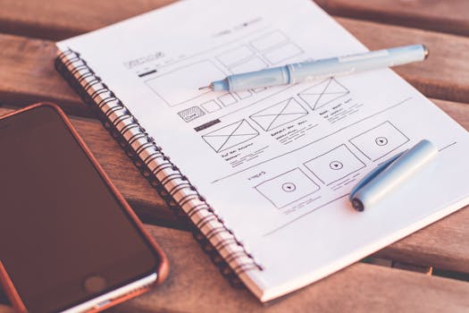
- Build the mobile layout before anything else. Wireframes and mockups should focus on the smallest screen so desktop assumptions do not sneak into the design.
- Test on real devices. Touch targets, font sizes, and navigation should be checked on the phones people actually use.
- Scale up with progressive enhancement. Once the mobile version works, expand the layout for larger screens using responsive techniques and CSS that build from the mobile base.
- Repeat the cycle as content and goals evolve. Mobile-first is not a one-time project. It is a way of approaching every redesign and every new page.
This process keeps the focus where it belongs: on the experience that most users will actually have.
Why Growing Businesses Should Pay Attention
Small businesses and local service providers have a great deal to gain from mobile-first web design. Customers often find them through a phone search, check the website, and call or book within a single session. If the site loads poorly on a smartphone, that customer may move on to a competitor.
The practical benefit of mobile-first design is that it forces clarity. You identify what is indispensable for users and build the experience around that. For a growing business, that means a website that works harder, loads faster, and gives visitors a clear path forward.
Mobile-first design also makes future work easier. When the mobile experience is the foundation, new pages, new content, and new campaigns are built on a base that already performs well on the most common screen size.
Frequently Asked Questions
Is mobile-first design still relevant in 2026?
Yes. Mobile traffic accounts for over 60% of global web usage, and Google indexes the mobile version of every site for search rankings. That makes mobile-first design one of the most direct ways to improve both user experience and discoverability. Businesses are still investing in it because most users browse websites primarily through smartphones, and that pattern continues into 2026.
What is the difference between mobile-first and responsive design?
Mobile-first is a design philosophy and development approach where you create the mobile version of a website before designing for desktop. Responsive design is the technical practice of making a site adapt to different screen sizes. A mobile-first project often uses responsive techniques, but it starts with the smallest screen and progressively enhances for larger devices like tablets and desktops.
Why does mobile-first design matter for SEO?
Google indexes the mobile version of every website for search rankings. If the mobile experience is slow, cluttered, or hard to navigate, search performance can suffer. Mobile-first web design improves the smaller screen experience, which supports engagement and aligns your site with the version Google uses to evaluate and rank your pages.
Can a small business benefit from mobile-first web design?
Yes. Most users now browse websites primarily through smartphones, and local customers often discover businesses through mobile search. A mobile-first approach focuses on what is indispensable for users, which helps small businesses deliver a cleaner, faster, and more useful experience. That clarity can translate into more calls, more bookings, and more sales.
