


Logo design in 2026 is less about visual novelty and more about meaningful distinction. Brands are no longer competing only on aesthetics; they are competing for attention, trust, and emotional connection across crowded digital environments. A logo today must perform across screens, motion systems, packaging, social feeds, and real world applications. For local brands, this shift is especially important. A well-designed logo signals credibility, builds familiarity, and helps a small business stand out in its community. Understanding the logo design trends for 2026 can give local brands a strategic advantage, helping them create identities that are both current and timeless.
Why Logo Design Trends Matter for Local Brands
Local brands face unique challenges. They need to compete with larger companies while maintaining a personal, approachable image. Logo trends for 2026 offer fresh ways to achieve that balance. Many of these trends move away from sterile minimalism and instead embrace warmth, craftsmanship, and character. For a local coffee shop, boutique, or service provider, adopting a trend like storybook gothic typography or a hand-drawn seal can immediately communicate heritage, quality, and a human touch. Trends are not about blindly following fads; they are about understanding the visual language that resonates with today’s customers. When a local brand uses current design cues, it signals that the business is modern, attentive, and invested in its presentation.
Top Logo Design Trends for 2026
The following trends are shaping brand identities this year. Each offers local brands a way to create a distinctive mark that feels both personal and professional.
Storybook Gothic and Heritage Typography
One of the most prominent trends is story driven gothic and heritage typography. This style draws on old-world letterforms, decorative serifs, and ornate details that feel like they belong on a book cover or an antique sign. For local brands, a gothic-inspired wordmark can instantly convey history, tradition, and permanence. A family-run restaurant or a local hardware store might use this approach to suggest generations of trusted service. The key is to pair these weighty letterforms with modern spacing or simple iconography so the logo feels fresh rather than dated.
Warm Organic Logos (Toasty Logos)
Another trend gaining traction is the warm, organic logo, sometimes called a “toasty” logo by designers. These marks use soft curves, earthy colors, and subtle gradients that mimic natural materials like wood, clay, or linen. They feel inviting and tactile. For local brands such as bakeries, florists, wellness studios, or children’s services, a warm organic logo creates an immediate sense of comfort and approachability. It’s the visual equivalent of a friendly smile, which is exactly what many small businesses want their customers to feel.
Stamp and Seal Logos
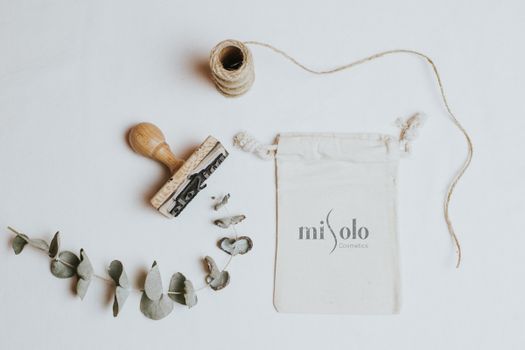
The stamp and seal logo trend borrows from official wax seals, rubber stamps, and embossed emblems. This format typically uses a circular badge, a central symbol, and type that wraps around or sits within a border. Stamp logos communicate authenticity, authority, and craftsmanship. Local consultants, tradespeople, and professional services (like accountants, real estate agents, or mechanics) can use this style to build instant trust. The enclosed shape also works well on packaging, business cards, and digital profiles, giving the brand a cohesive, official appearance.
Pixel Sharp Precision and Micro Details
At the opposite end of the spectrum, pixel sharp precision and micro details as identity anchors are making a strong showing. This trend focuses on crisp lines, geometric accuracy, and tiny elements that become a brand’s signature, like a unique dot pattern, a minuscule icon, or a perfectly spaced monogram. For local tech startups, co-working spaces, or modern cafes, this style signals meticulousness and high quality. It demonstrates that the brand cares about the small things, which builds confidence in its offerings.
Adaptive Systems and Modern Monograms
Adaptive systems are logo families that shift across contexts, a primary mark, a simplified icon, and a typographic version all working together. Modern monograms fit within this framework, offering a clean, letter-based identity that can be used in small spaces like social media avatars or app icons. Local brands with multiple touchpoints (a gym that runs classes, a boutique with an online store, a contractor with a vehicle fleet) benefit from a logo that adapts without losing recognition. This approach ensures consistency across print, digital, and physical materials.
Hand-Drawn Details and Naive Elements
Naive hand-drawn details are another major trend for 2026. These marks look intentionally rough, as if they were sketched with a pen or brush, often with slight irregularities that make them feel human and imperfect. This style is perfect for local brands that want to emphasize personality and creativity: artists, makers, boutique shops, and food vendors. Hand-drawn logos stand out in a sea of polished, vector-perfect designs because they look like they came from a real person, not a computer.
Bold Monochrome Contrast
Bold monochrome contrast uses stark black and white (or deep color on light backgrounds) with strong shapes and minimal shading. This trend creates high visibility, which is critical for local brands that appear on signs, vehicle wraps, or merchandise. A bold monochrome logo scans quickly and works in one-color printing, keeping costs low for small businesses. It also translates well to digital screens where clarity and speed are essential.
How to Choose the Right Trend for Your Local Brand
Not every trend fits every business. A family restaurant might gravitate toward storybook gothic or organic warmth, while a tech consultancy may prefer pixel sharp precision or a modern monogram. The best approach is to start with your brand’s core values and target audience. Consider where your logo will appear most: on a storefront, a delivery van, a website’s header, or social media posts. Each use case demands a different level of detail and adaptability. Also think about longevity. Trends like stamp and seal or heritage typography tend to age well, while extremely niche styles might feel dated faster. A good designer will help balance trendiness with timelessness, ensuring your investment pays off for years.
Local brands have an advantage over national chains: they can be more personal. Trends like hand-drawn details or warm organic logos let that personality shine. But even trends that feel more corporate, like modern monograms or pixel sharp precision, can be infused with unique color or local references to keep them grounded in the community. The goal is not to copy a trend exactly but to use it as a starting point to create something that feels authentic to your business.
Frequently Asked Questions
How often should a local brand update its logo?
There is no fixed rule, but a logo refresh every five to ten years is common. However, if your brand is undergoing a major change in services, audience, or location, a sooner update may be wise. In 2026, many brands are moving away from minimalism and toward more expressive identities, so consider whether your current logo still communicates the right message.
Can a local brand use multiple logo trends at once?
Yes, but with caution. Many successful 2026 logos combine two trends, such as a stamp format with warm organic colors, or gothic typography with a pixel sharp icon. The key is to keep the overall look cohesive. Too many conflicting styles can confuse viewers and dilute brand recognition. Work with a designer to blend trends in a balanced way.
Are AI-generated logos a good choice for local brands?
AI-generated designs are one of the trends for 2026, but they come with limitations. While AI can produce quick concepts, it often lacks the strategic thinking and emotional nuance needed for a strong local brand identity. A logo from a professional designer will be more original, adaptable, and aligned with your brand story, qualities that help small businesses build lasting trust.
How can I make my logo stand out in a busy local market?
Focus on clarity and uniqueness. Avoid cliches like generic coffee cups or houses. Instead, use a trend that reflects your specific offering. For example, a stamp logo with a hand-drawn illustration of your actual product or service creates a memorable mark. Also ensure your logo works well in small sizes and black and white, as these are common constraints for local advertising and signage.
Choosing the right logo design trends for 2026 can help your local brand build credibility, visibility, and a deeper connection with customers. Whether you opt for the warmth of organic shapes, the authority of a seal, or the precision of pixel sharp details, the most important factor is that your logo truly represents your business. A thoughtful design is not just an expense, it is an investment in how your community sees and remembers you.
