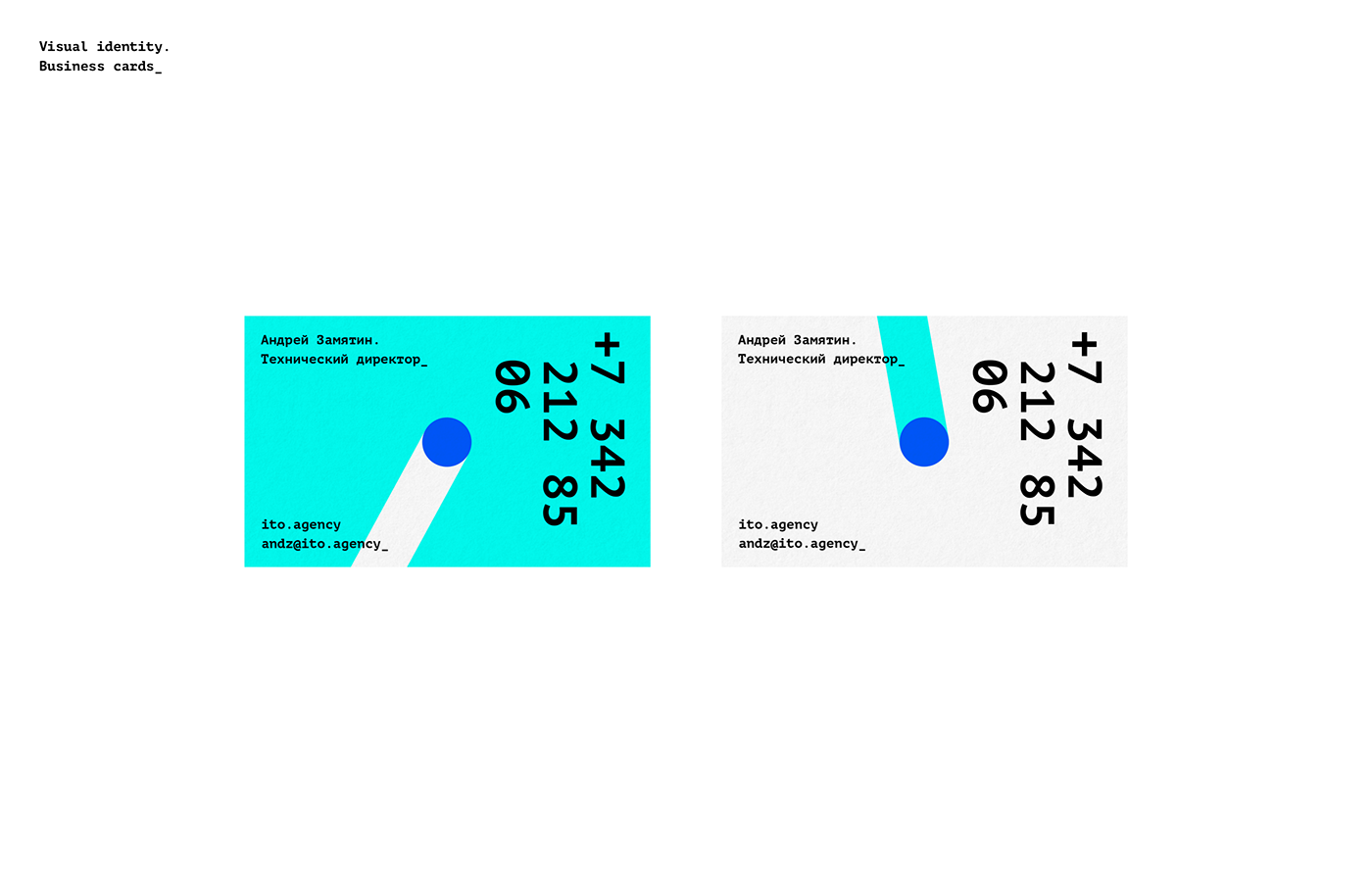
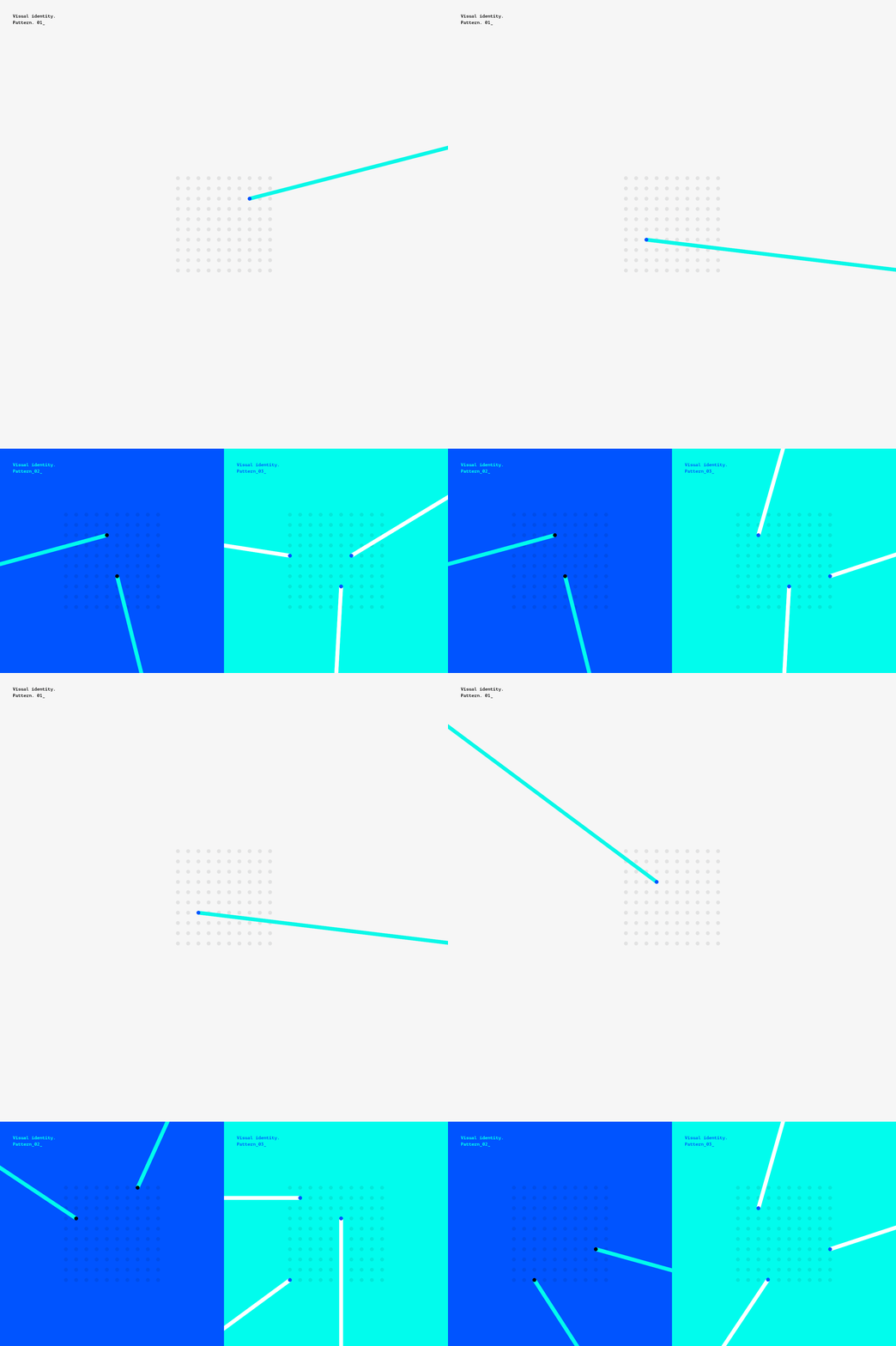
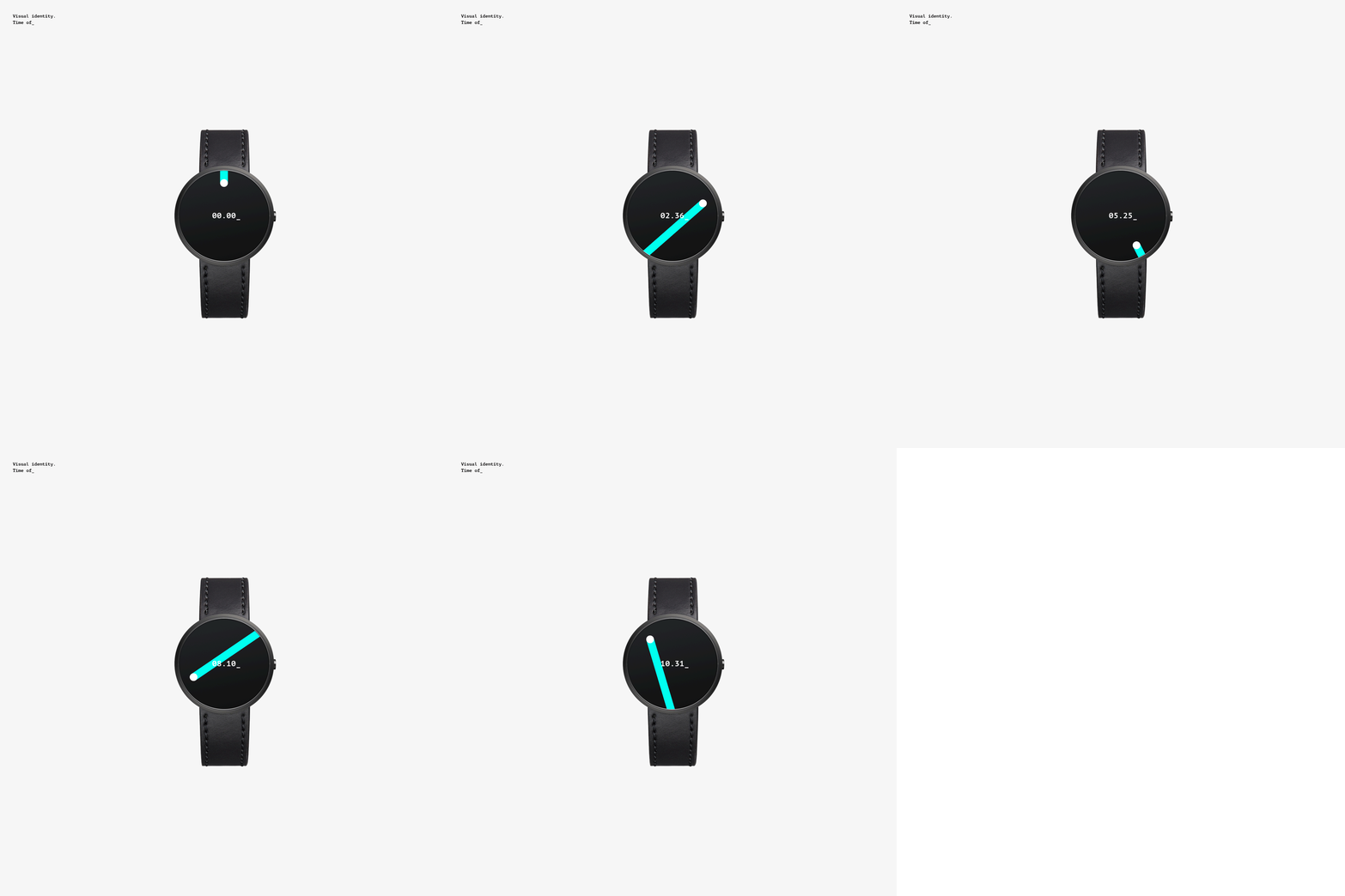
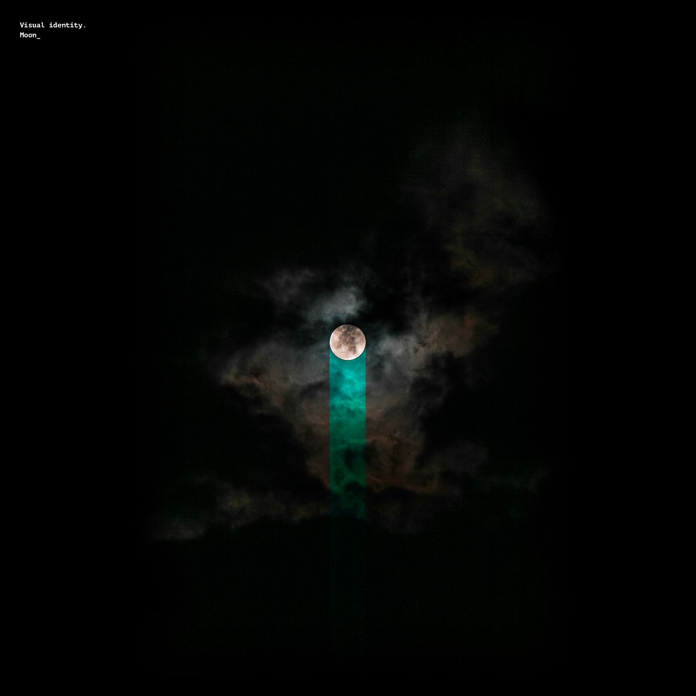
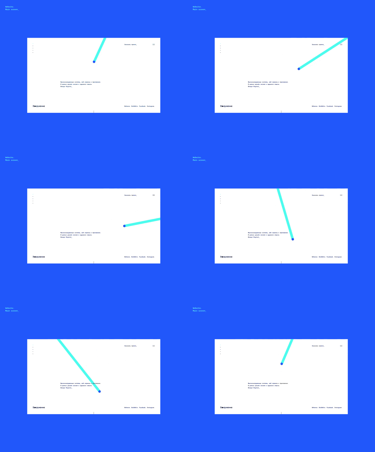
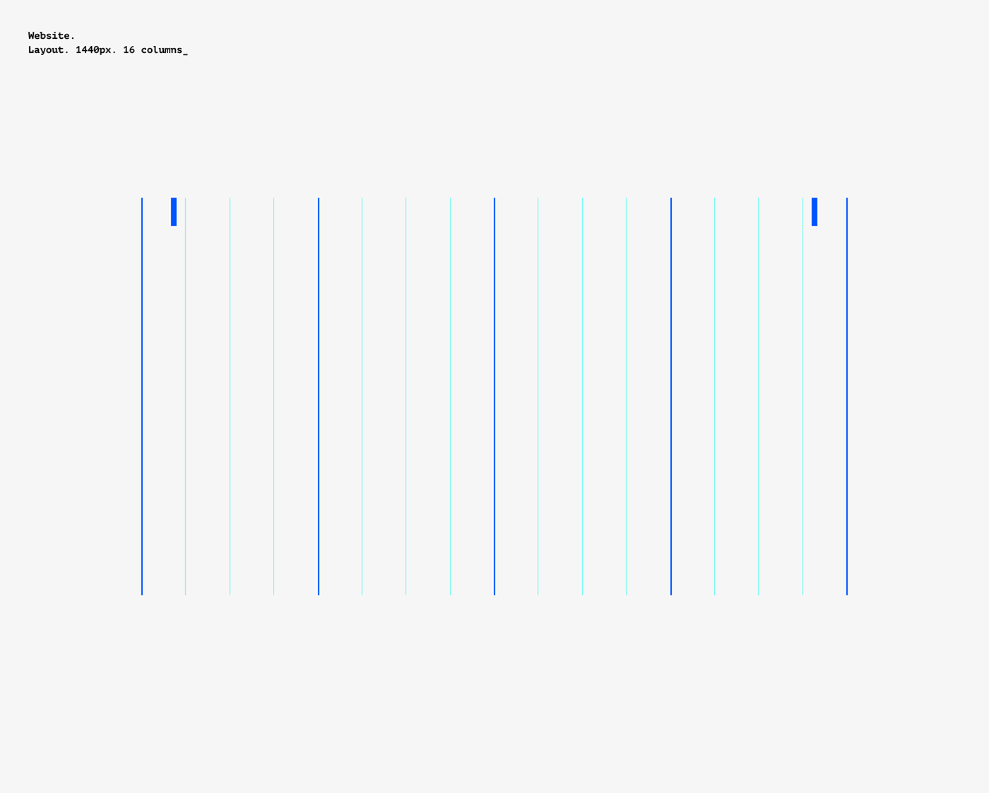
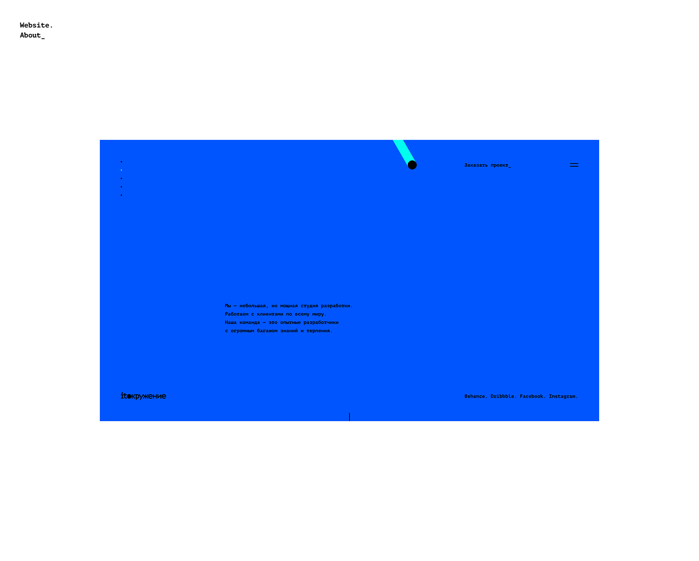
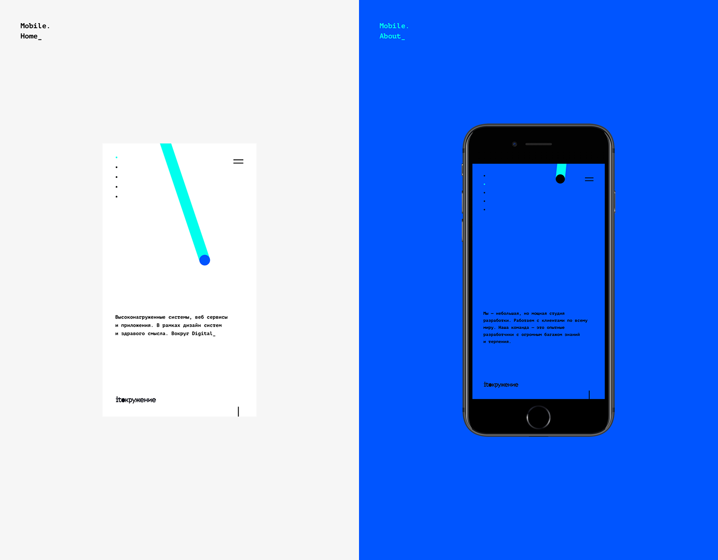
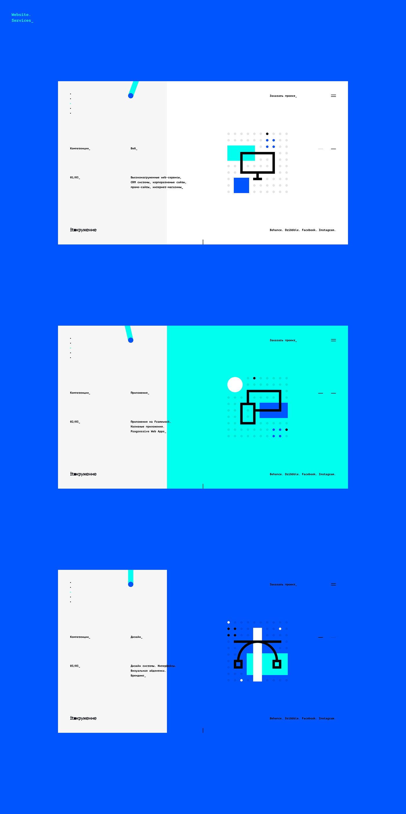
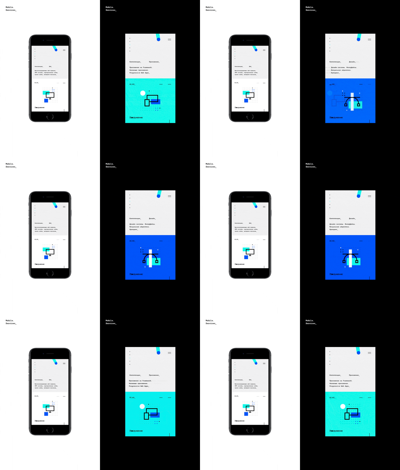
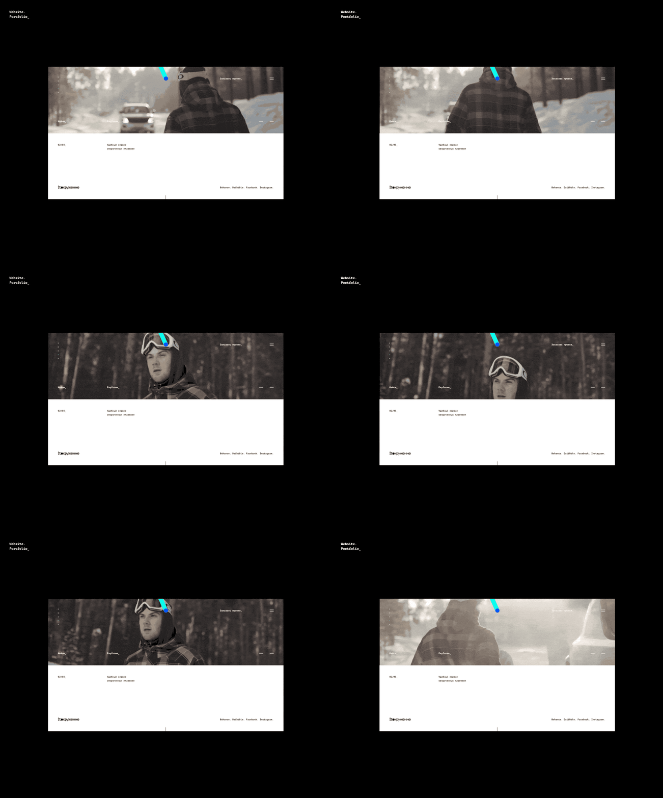
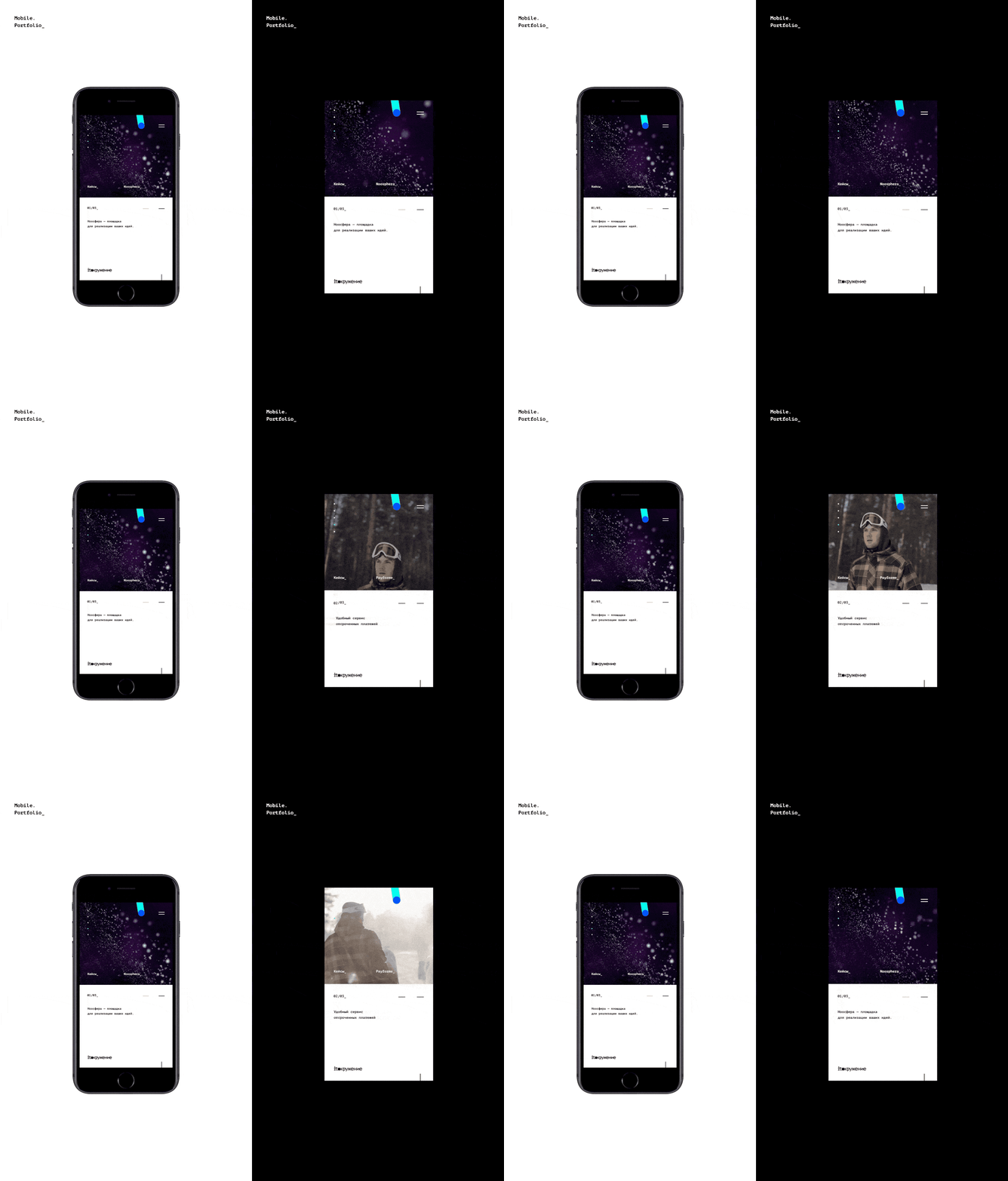
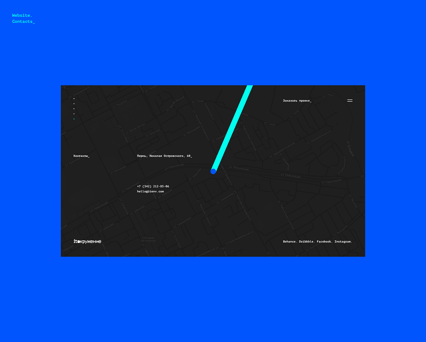
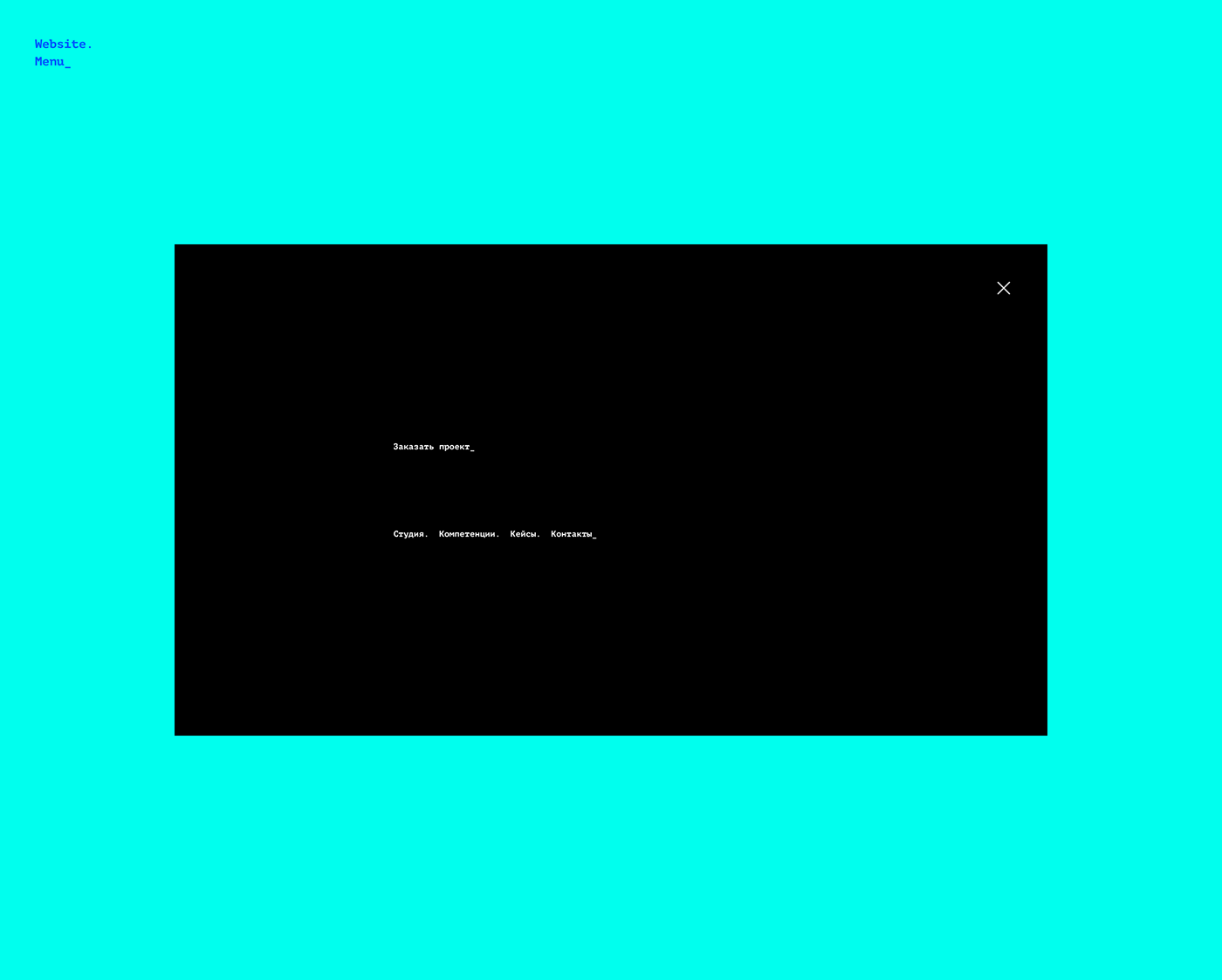
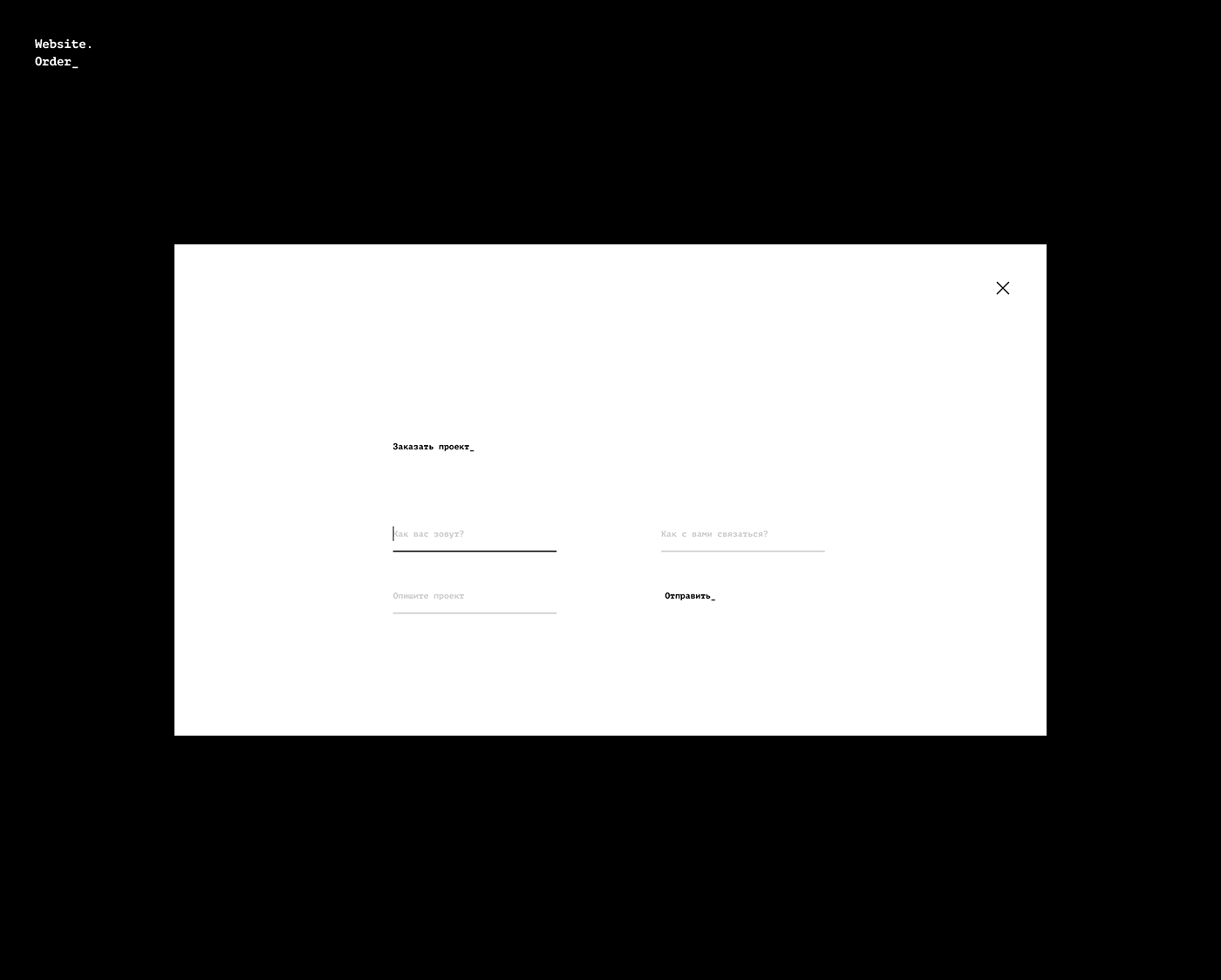
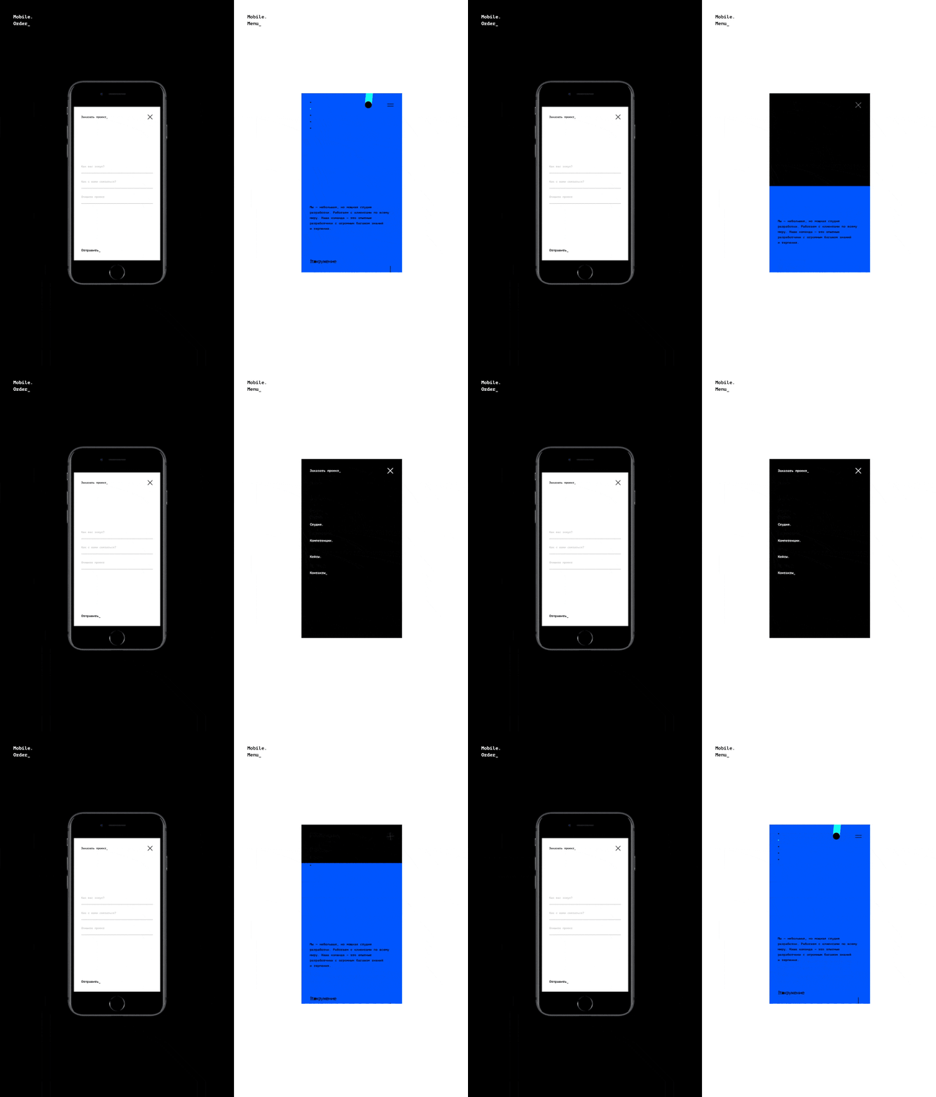
I don’t speak Russian but I really like this brand identity and web design project that Vik — shared on his Behance profile for ITO. I don’t know exactly what ITO is so I will focus my comments to the aesthetics. There are tons of things that make it worth sharing, but I would definitely start from the simplicity and color scheme. Sometimes it feels a bit too stark or difficult to read, but as a concept it works quite well in my humble opinion. I appreciate the fact that there are some prototypes and motion studies.
For more information about Vik make sure to check out his portfolio at http://vikdesign.ru/


