SEO is a complex matter and one that web designers and developers might feel is best left to copywriters and search professionals to handle. That makes sense since many common SEO hacks revolve around the manipulation of content and the tagging of it for search.
Here’s the thing though: there are certain choices you make as a web designer that ultimately affect the search-friendliness of your website. Which means you should be involved in the diagnosis and repair of a website’s SEO mistakes.
Repairing SEO Mistakes with Web Design
A click-through rate (CTR) tracking study from Advanced Web Ranking reported the following data, from as recent as September 2018:
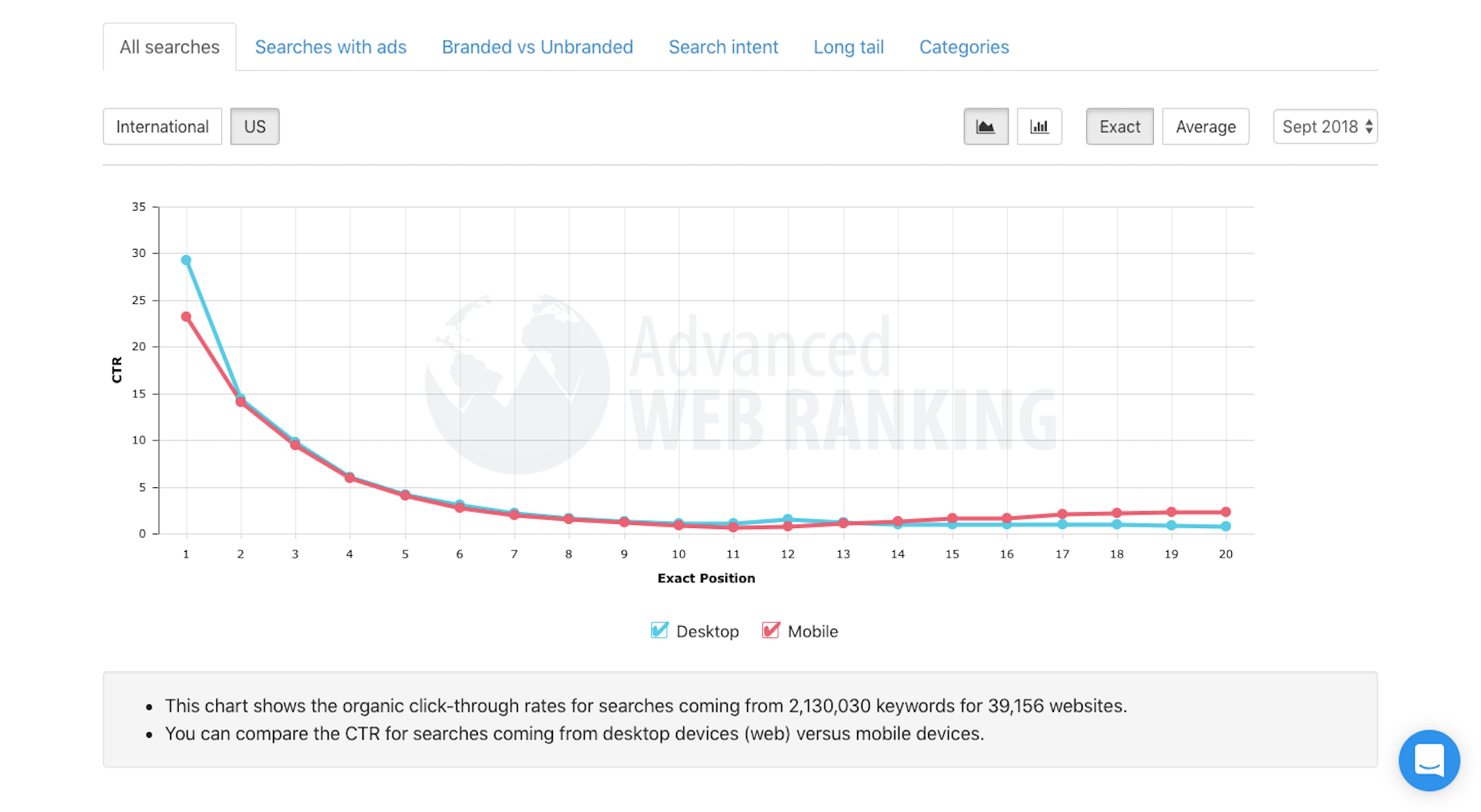
What this shows is the likelihood of users clicking on an organic link based on its position in search
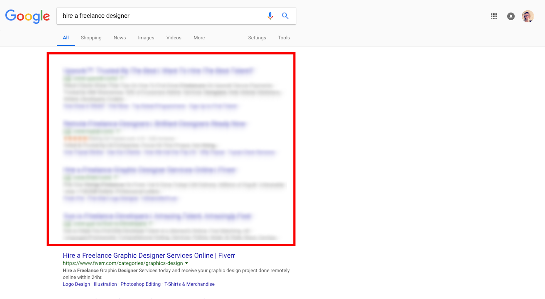
As you can see, Google is already stacking the odds against your website by filling its prime real estate with paid listings. That said, the data above is proof that search users are willing to sift through paid promotions to get to the genuinely good website recommendations. The only thing is…
How do you repair a website’s SEO mistakes so it can get to the top of search?
Mistake #1: Non-Responsive Elements
We’re operating in a mobile-first world which means websites have to be designed primarily for that experience. That doesn’t mean leaving desktop users out in the cold, but it does mean dotting your i’s and crossing your t’s to ensure that every element fits within the truncated space of a mobile screen.
Running your website through Google’s Mobile-Friendly Test isn’t enough.
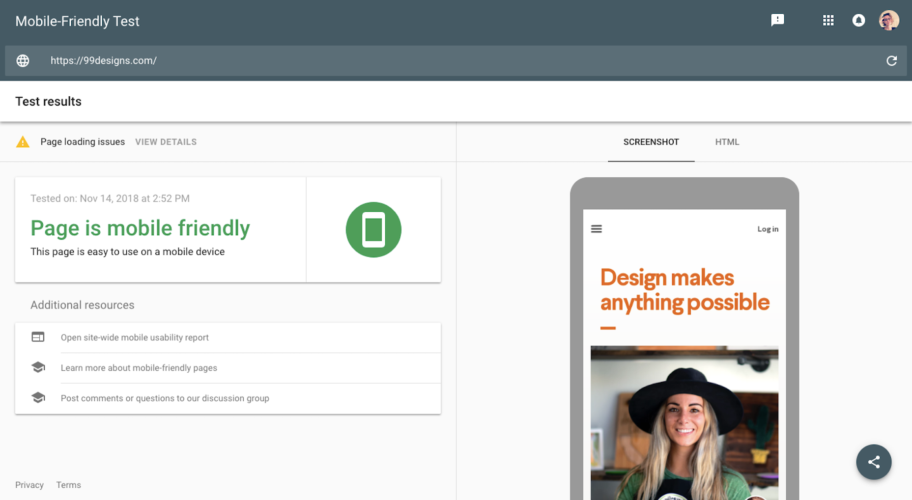
Open your mobile device and walk through every page of your website. Does everything fit between the two edges of your phone? Are the buttons correctly sized and placed? Are images displayed in full and without distortion?
If not, then start here.
Mistake #2: Usability Issues
If we’re talking about usability issues that are severe enough to cause a high percentage of bounces—which communicates to Google that your website isn’t worth ranking—start by looking at the navigation.
Let’s use this one from Hearth Kitchen as an example:
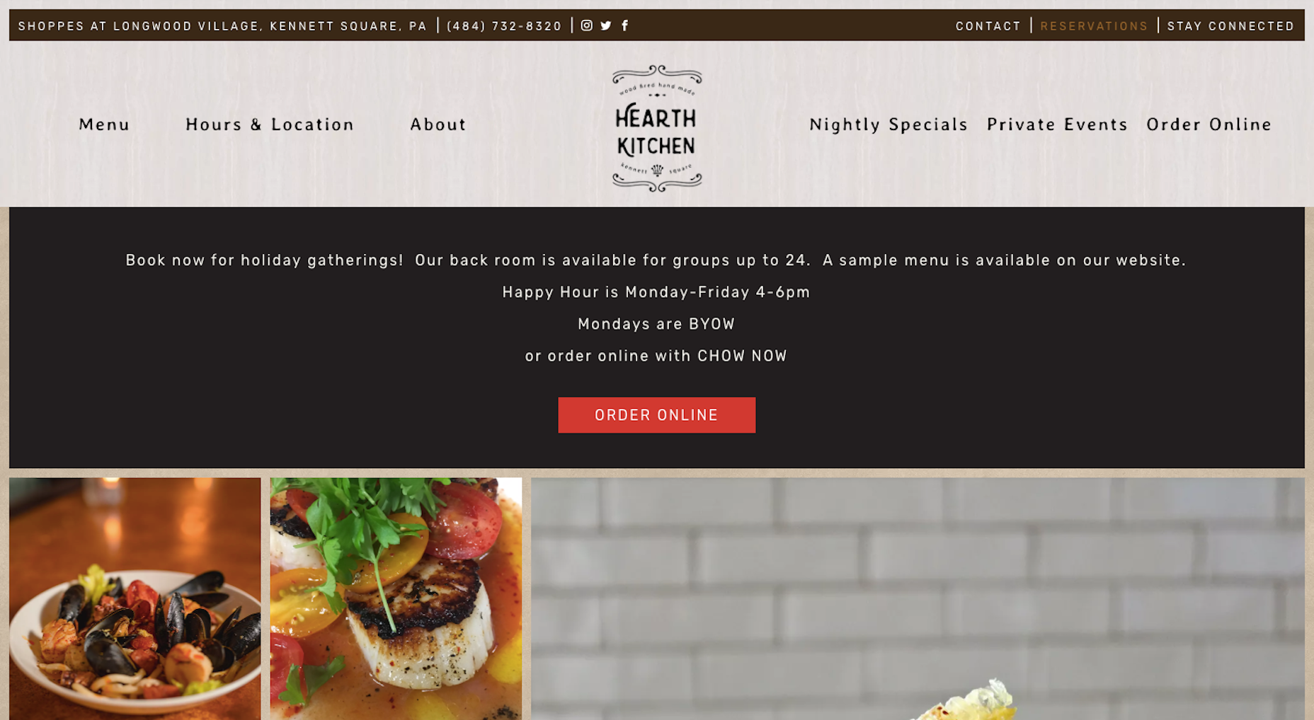
As you can see, the navigation is clearly laid out in a horizontal row. Labels are clear and all pages are present—there’s nothing confusing or hidden. In addition, the header provides users with other information they’d instantly want from a website of this nature.
Since users’ eyes tend to track in a Z-pattern (starting in the top-left and working their way across), your navigation is the first thing visitors see and realistically might be to blame for a lackluster performance in search.
Mistake #3: Low Readability
Although visual content enhances comprehension as well as memorability of what’s on a web page, your visitors eventually need to read the words on it. When that becomes a struggle, websites suffer from short times-on-page and high bounce rates.
Look, you know that your visitors don’t have much of a patience for anything these days. The least you could do is make the reading experience easy for them.
Has your website’s content violated any of these rules?
- Typefaces are black (or nearly black) on a white background.
- Fonts are in the serif or sans serif families (i.e. be careful with decorative fonts).
- The smallest font size should be 16 pixels or larger.
- Lines are between 50 and 60 characters.
- Paragraphs contain no more than 3 or 4 lines.
- Images or lists break up large chunks of content (like I’m doing here).
- Headers enables readers (and search bots) to more quickly decipher what a page is about.
WebDesignerDepot does a great job of adhering to these principles, so if you’re looking for inspiration on how to make content readable, start here.
Mistake #4: Bad Pop-Ups
Everyone hates an ill-timed, irrelevant, or pushy pop-up. Google has even gone so far as to penalize mobile websites that utilize what it deems to be bad and intrusive pop-ups.
So, here’s what I’m going to say:
Utilize the least amount of space possible for your pop-ups.
Yotel has a fantastic example of this on its desktop website:
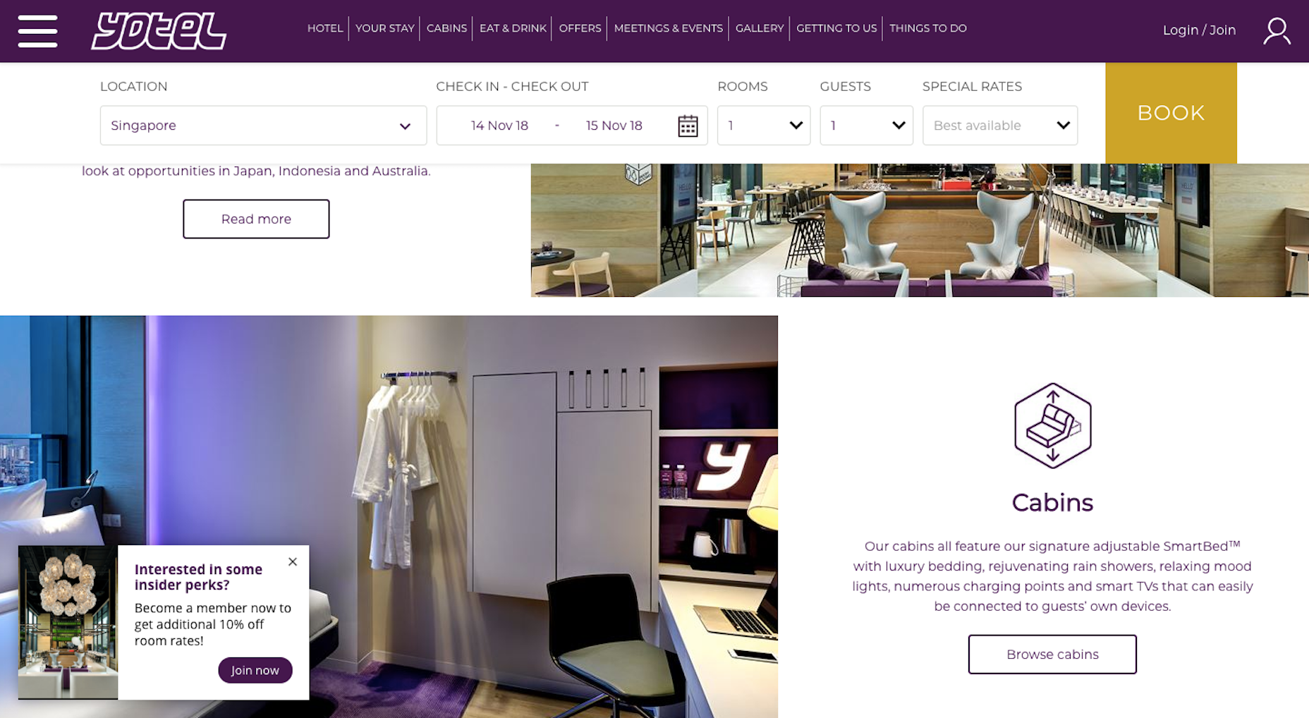
And, if pop-ups need to appear on mobile, relegate them to a top or bottom banner. It keeps your promotional message out of the way.
Mistake #5: Overweight Images
Google rewards websites that are fast—and we’re talking load times under three seconds. While there are a number of things developers can do to get loading speeds under control, designers should look at images to improve performance and SEO.
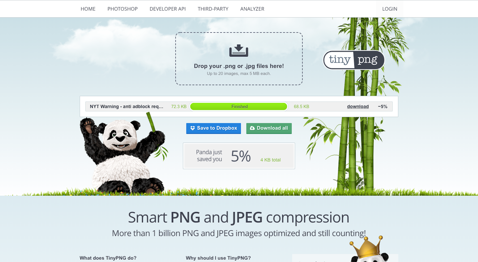
Specifically, look at file size.
There is only so much room an image can occupy on a website, especially in this age of mobile-first. So, why use a file that’s 12MB when it’s only going to show up as a thumbnail in the site’s news feed?
I’m not saying you should stop using oversized high-resolution images.
Just be sure to resize and run them through a compression software like TinyPNG to ensure you’re not overloading your web server.
Mistake #6: Text Inside Images
There are two reasons why text inside images is a bad idea for SEO. The first has to do with readability.
Think about what happens when text is laid atop an image. If there’s a distinct contrast between the two, readability should be fine. But what if text is placed over an otherwise mundane part of an image on desktop? On mobile, it shrinks down and may end up appearing over a busier and more distracting part of the photo.
Then there’s how the text is added. If text is pasted into an image file, search bots won’t be able to detect it. If your copywriters wrote that particular string of text with a search keyword embedded in it, you’ve just removed it from Google’s view.
Instead, you should work with your content management system to add text using custom fields meant to go on top of images.
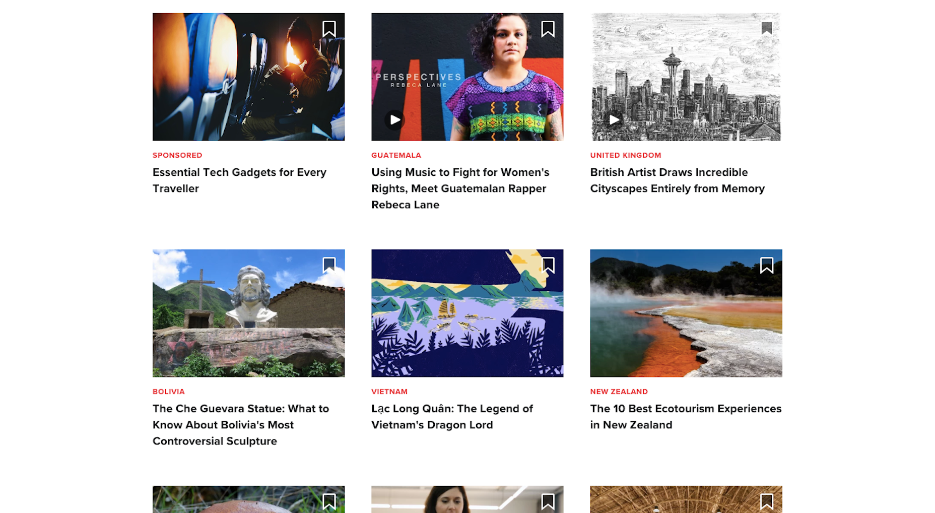
In my opinion, it’s best to stay away from text on images unless you can ensure uncompromized readability and that Google bots can read it. Culture Trip shows how this can be done:

It also has links lower on the page where the text is removed from the photo altogether (which I think looks even better):
Mistake #7: Lack of Trust Marks
The last mistake has to do with security. This is something Google cares about greatly, but a lot of it falls to a web developer to implement.
To do your part, find opportunities to include trust marks to boost the confidence of visitors as they travel around your website. Uncommon Goods includes a number of these at the bottom of the site:
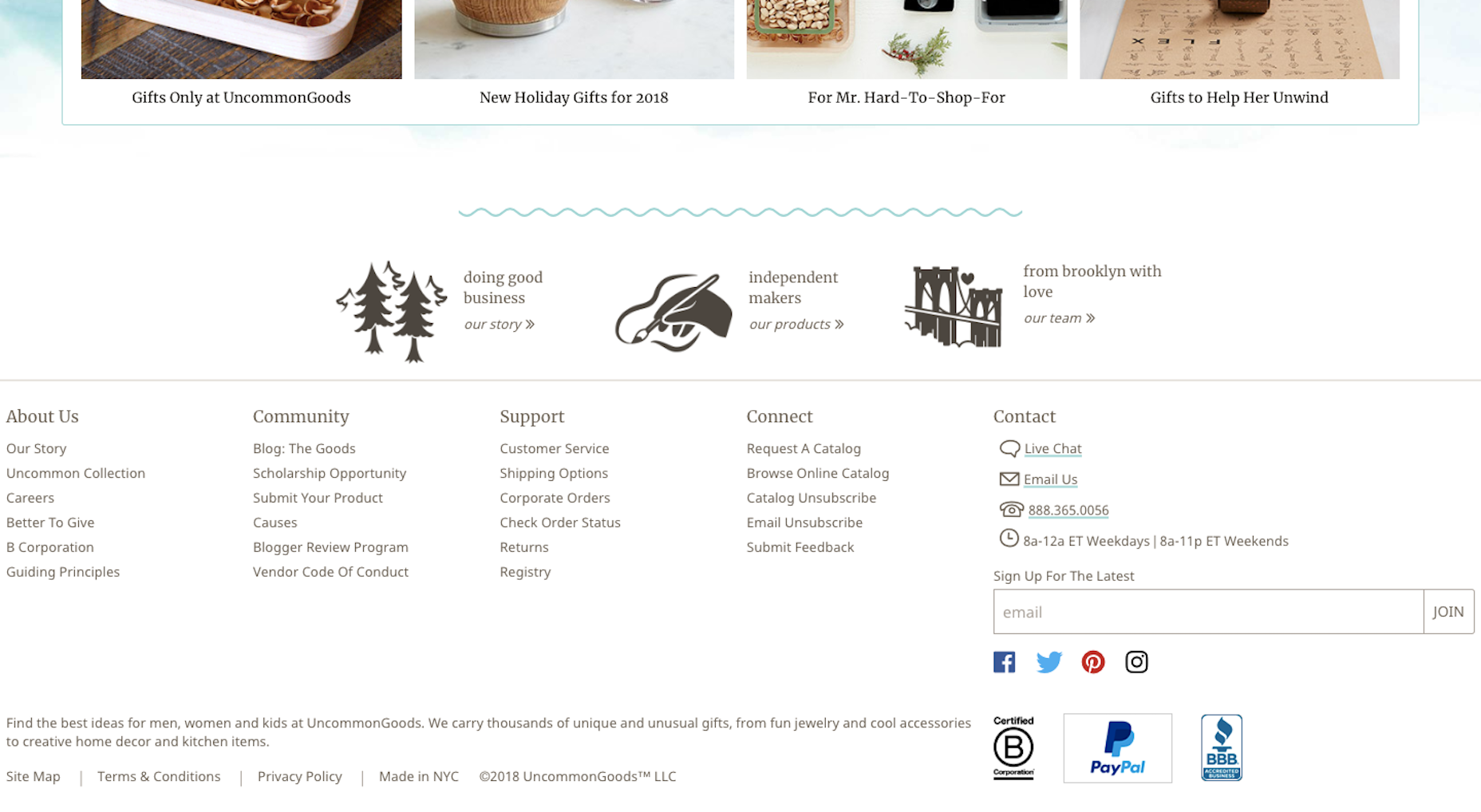
Trust marks may differ based on your website’s business type, but they do exist. Anti-malware software. SSL certificate. Secure payment gateway. These are the kinds of symbols that put your visitors’ minds at ease and allow them to stay longer and convert.
Wrap-Up
Now that you know some of the more common SEO mistakes caused by web design, be sure to account for them in your workflow going forward. You’d be amazed what improved performance, security, and usability will do for a website’s ranking!