Welcome to our monthly roundup of the freshest web designs, released (or rereleased with significant updates) in the last four weeks.
This month’s collection is all about being brave. Brave new ways to employ color, brave new ways to navigate UI, brave new ways to think of web sites. Highlights include cool Jazz, exciting new design agencies, and illustration everywhere. Enjoy!

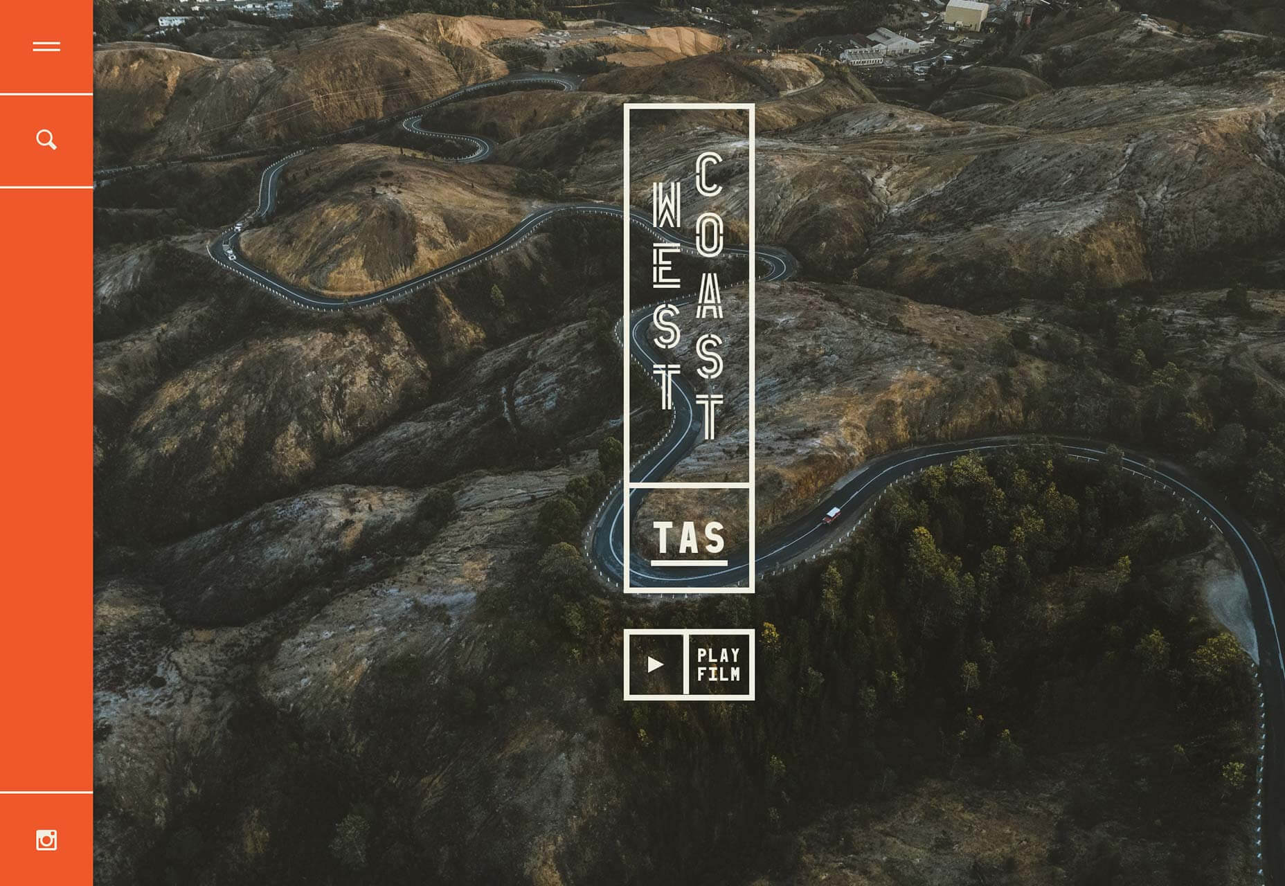
West Coast Tasmania
This exceptional site for tourism in Western Tasmania gets everything right. The colors and illustrations are tone-perfect, while the enticing photography is alluring to all but the most dedicated of couch potatoes.
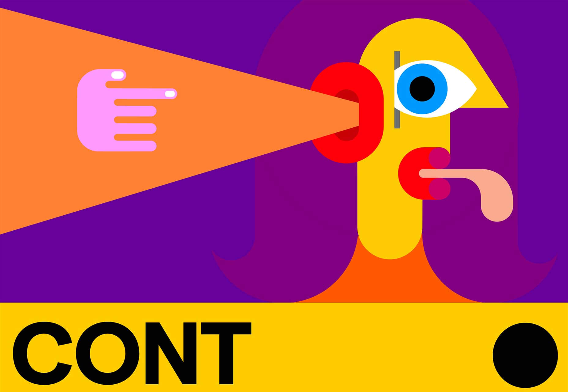
Jazz FM Romania
Romania’s Jazz FM does exactly what you’d expect: it hits you right between the eyes with a playful and creative approach. The illustrations are cool, but what really makes this site great is the all-in way they’ve been used.
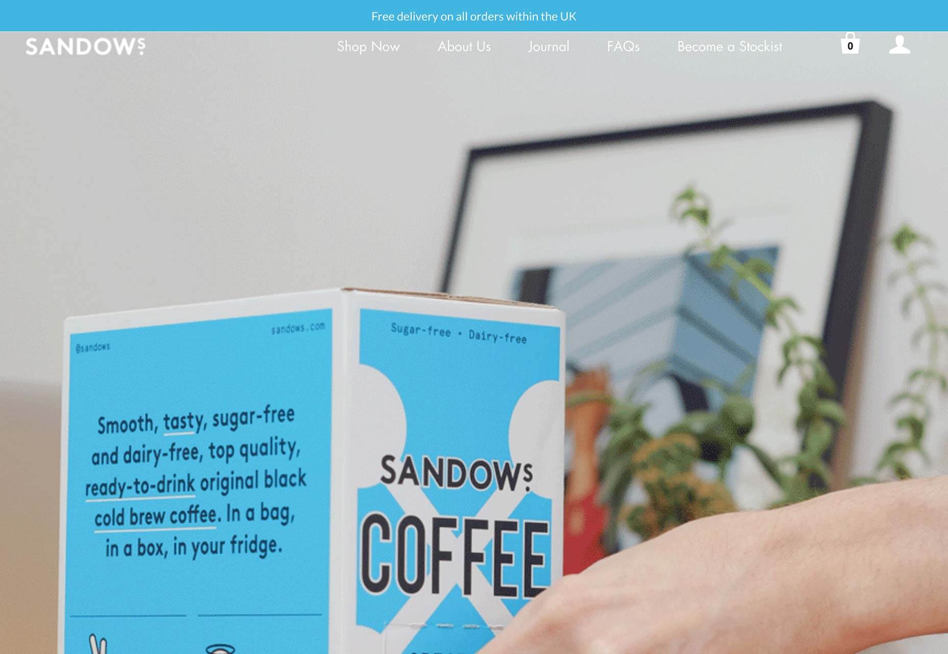
Sandows
Sandows is one of the market leaders in cold-brew coffee, and its site reflects that with professional UX, and delightful animation. I bet you haven’t seen animated gifs used like this before. It’s a refreshing alternative to fullscreen video.
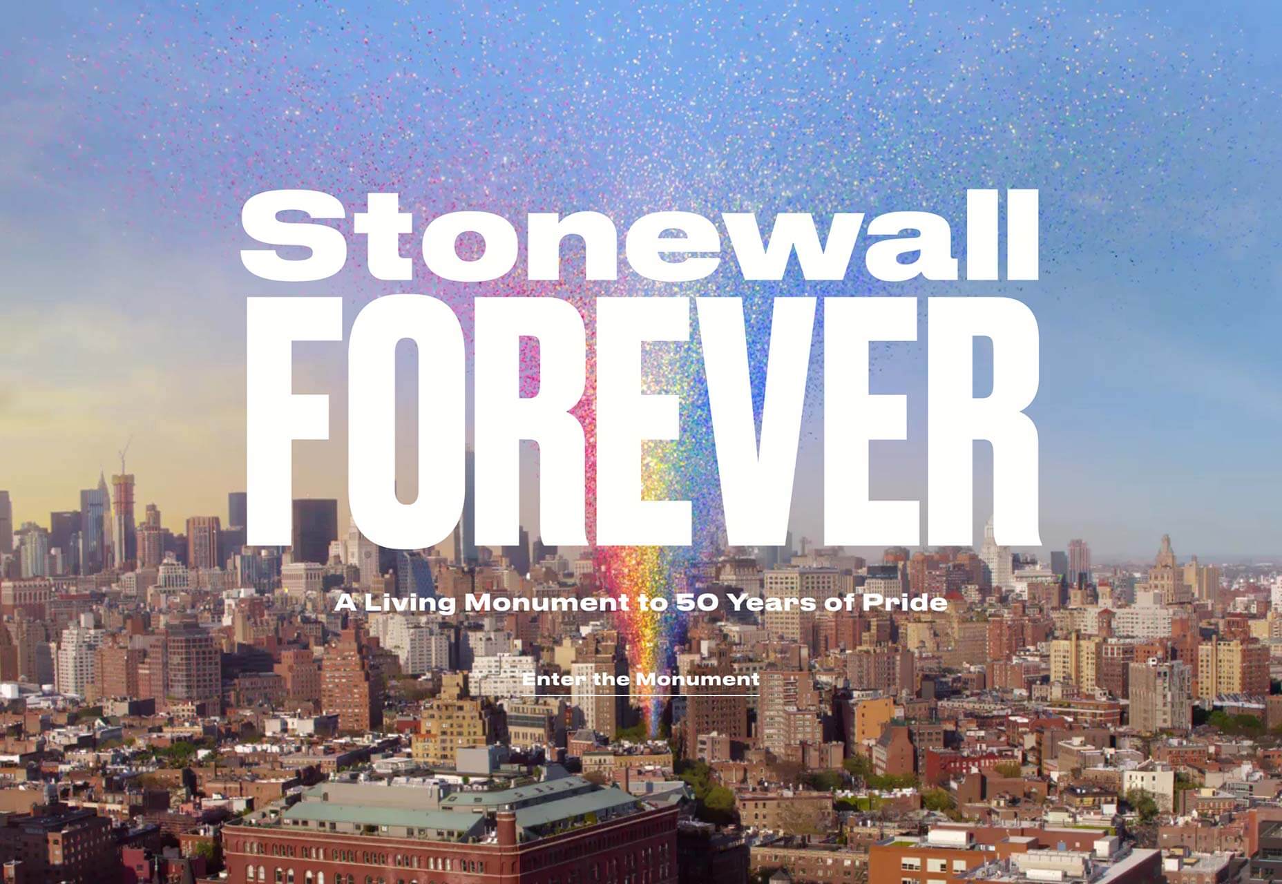
Stonewall Forever
Stonewall Forever describes itself as a living monument to 50 years of Pride. The generated rainbow features stories from the early days of the LGBTQ rights movement. Tap and drag to move through the rainbow and explore.
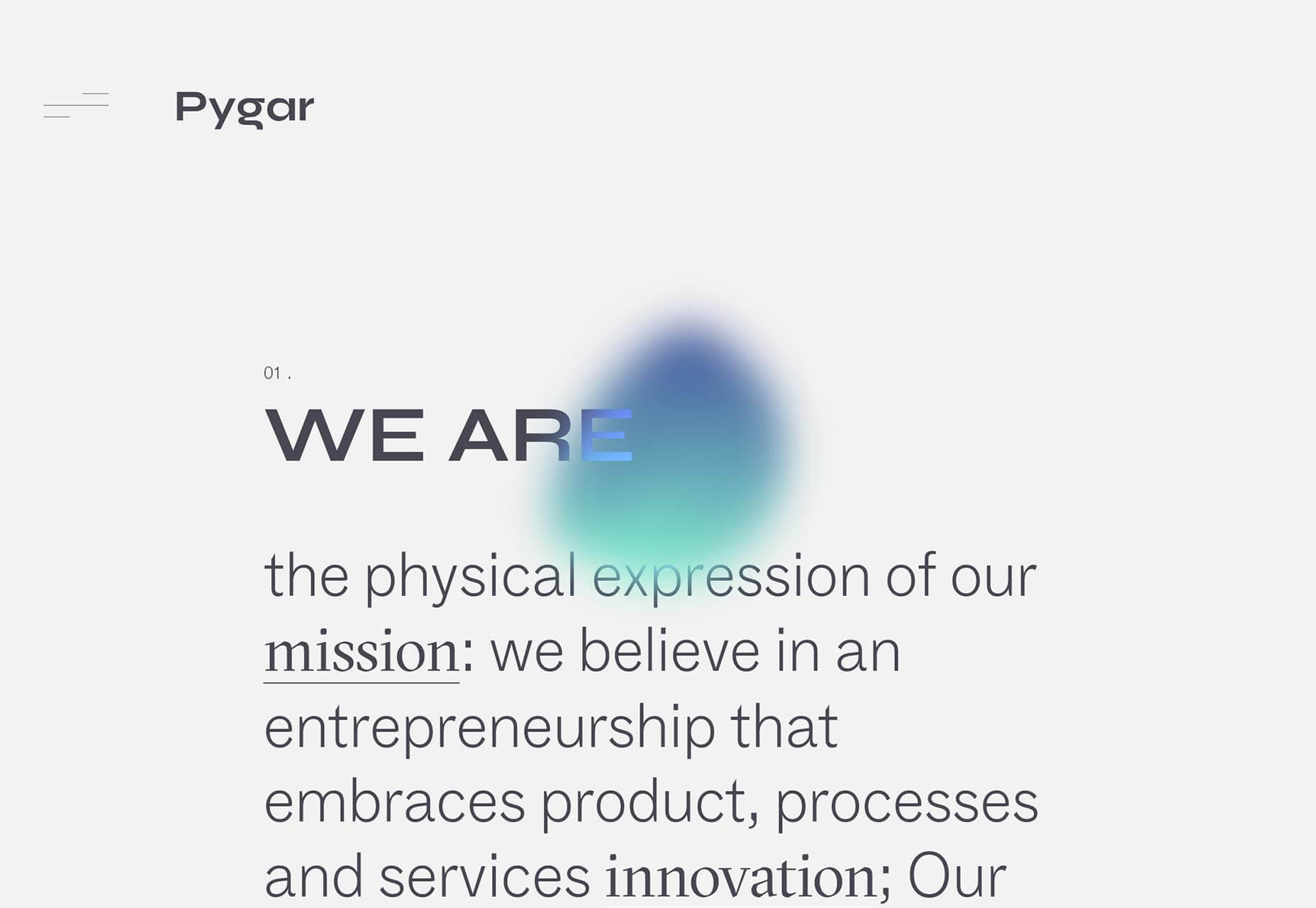
Pygar
Pygar is a financial investment company, and its site makes me think they’re braver and more innovative than most. The site’s hamburger menu is an interesting new take, and the next/prev previews in the colored blob create a seamless effect.
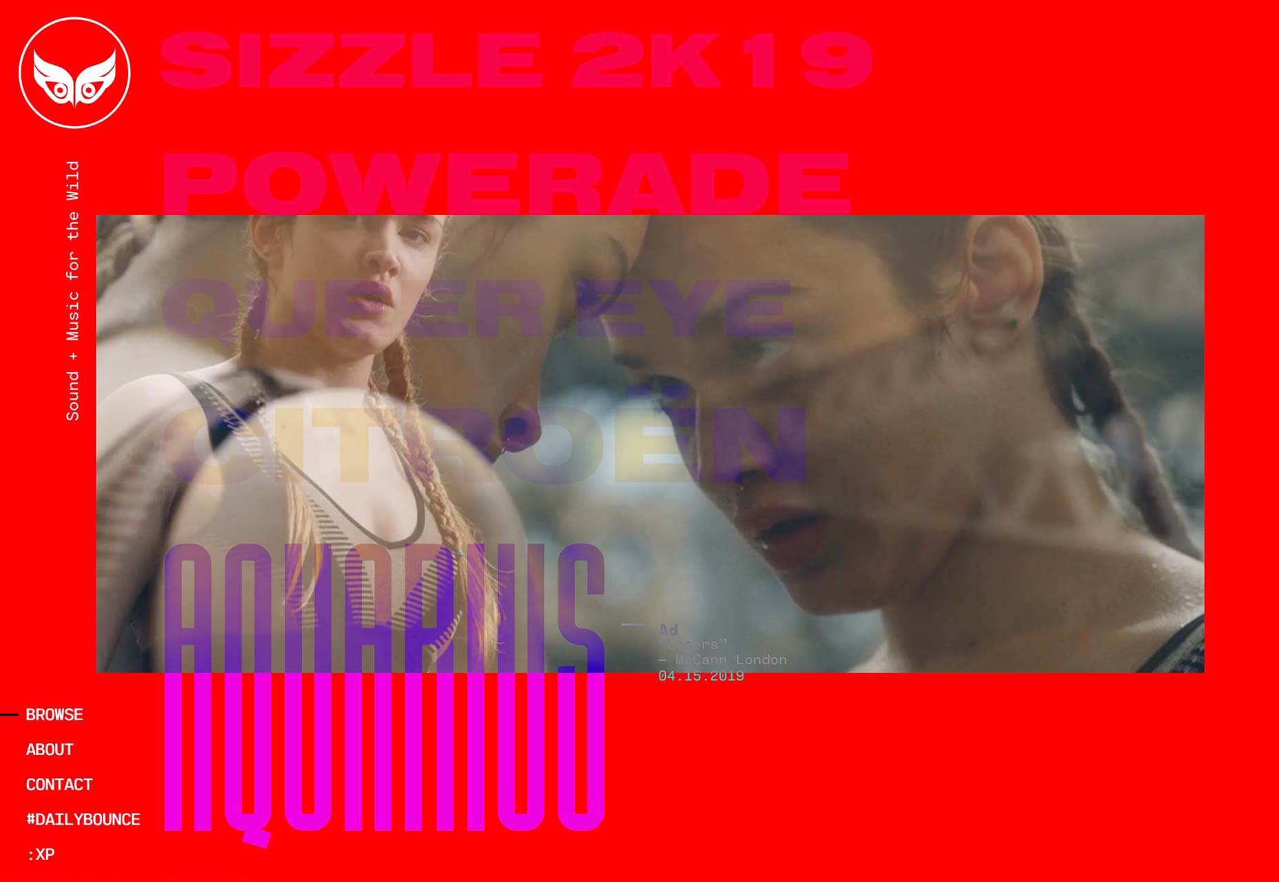
Safari Riot
Describing itself as a future-leaning sound and music group belies the fact that Safari Riot’s site is so visually stimulating. Scroll the homepage for a list of recent projects and hover over the bold project titles for a quick video preview.
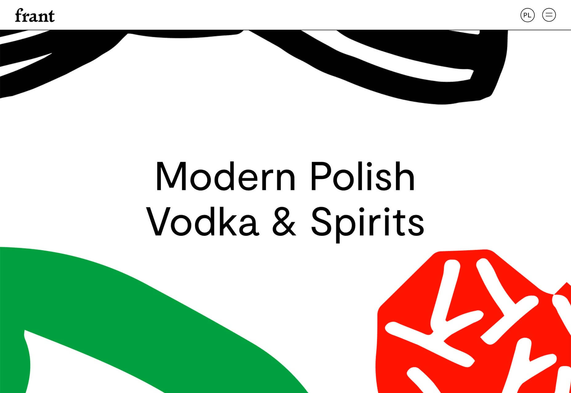
Frant
The standard — seemingly only — approach to alcohol sales is to take the heritage route. That’s especially true of spirits. Frant takes a radically different direction, with modern, bold, blocks of color that stand out from the rest of the shelf.
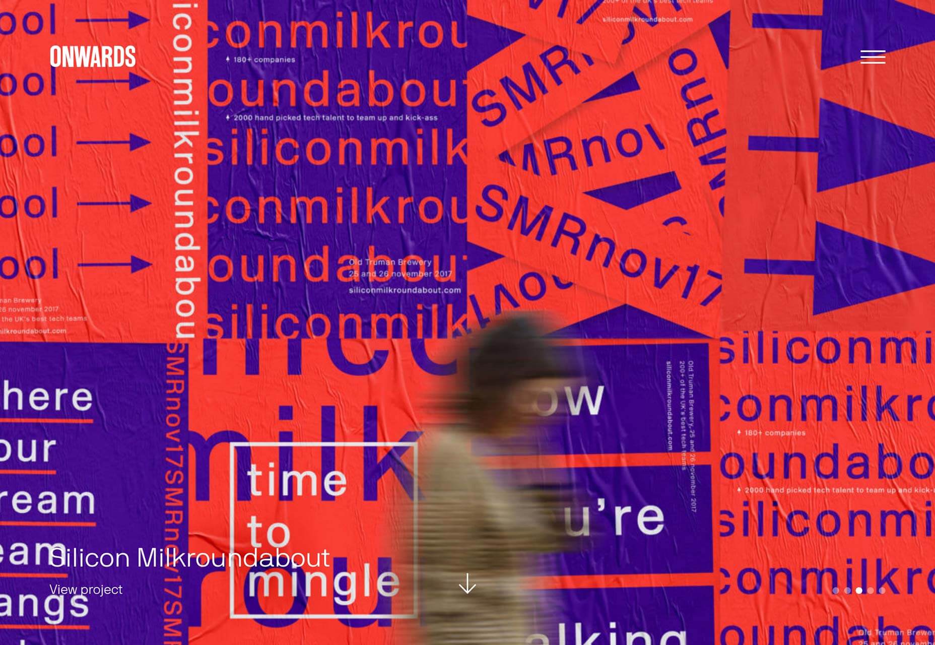
Onwards
Onwards is a London-based branding agency. Its site is clean, simple, and easy to use. I would normally deduct points for a hamburger menu on desktop, but as its target market is young startups, they get a pass on that.
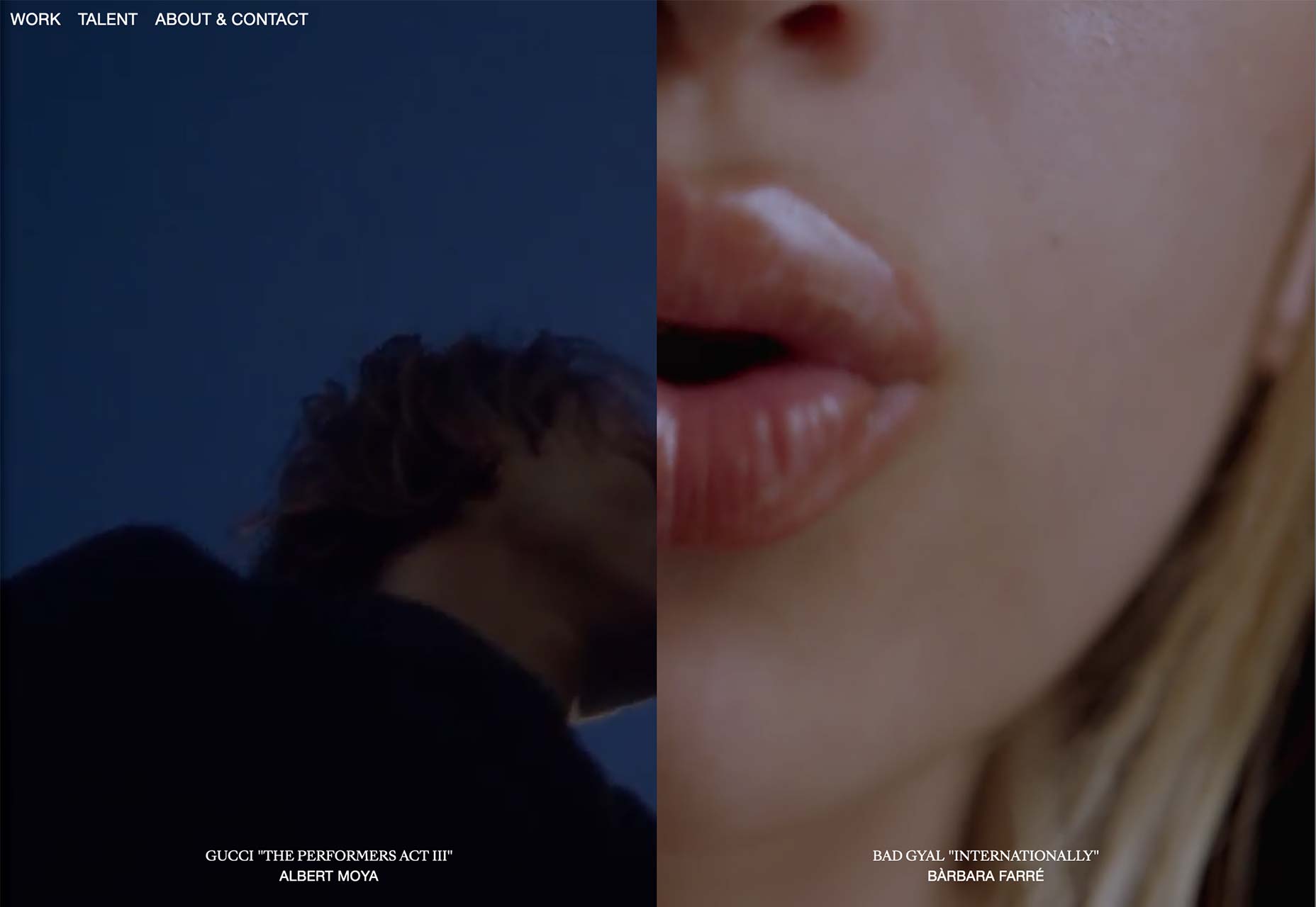
Pandora
A creative studio specializing in film and video, Pandora’s site uses split screen scrolling to juxtapose different elements of its portfolio. Scroll up and down to tab through the whole showreel.
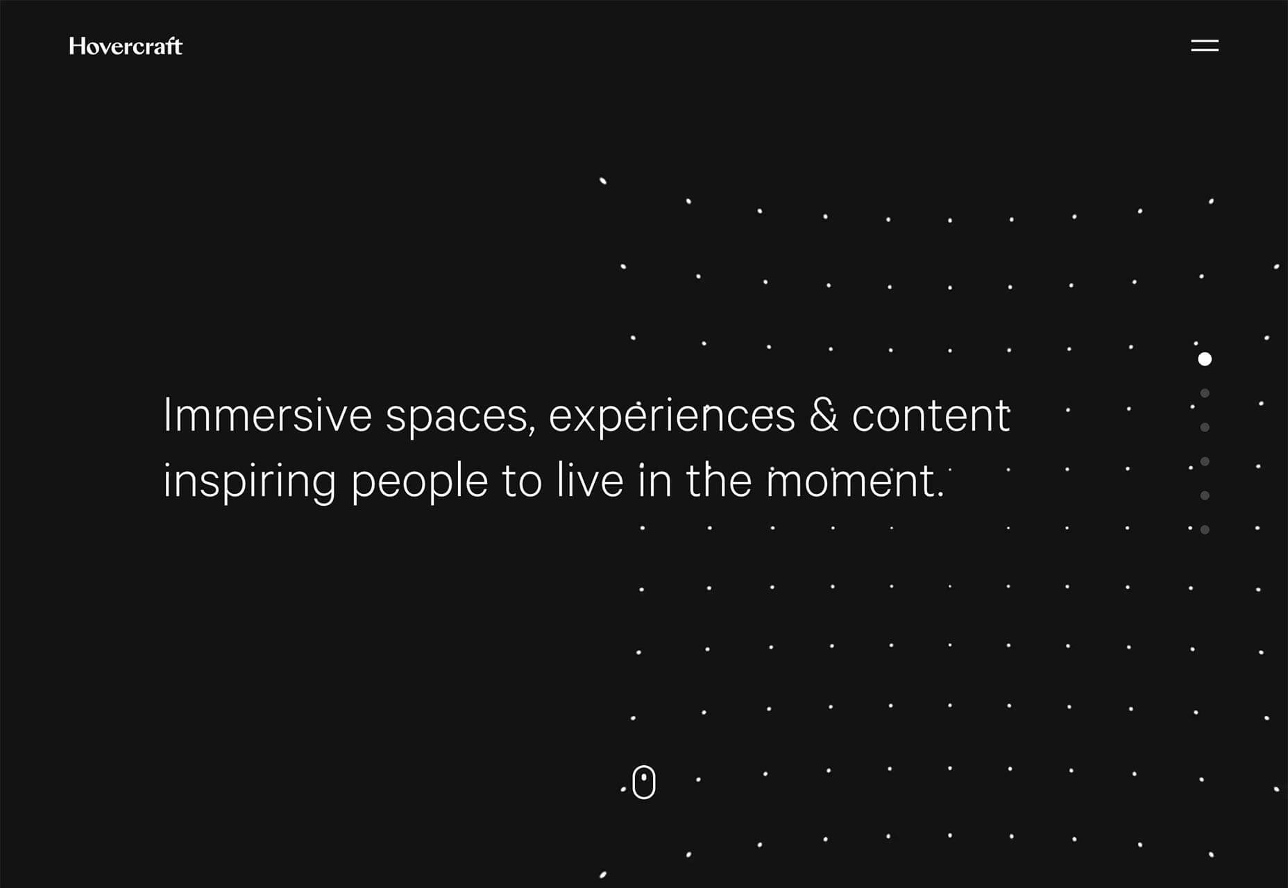
Hovercraft
Hovercraft’s site is a delight to behold, with simple animated dots being used to amazing effect to create the illusion of depth and energy. Beyond the first impressions, it’s a well ordered agency site with some excellent case studies.
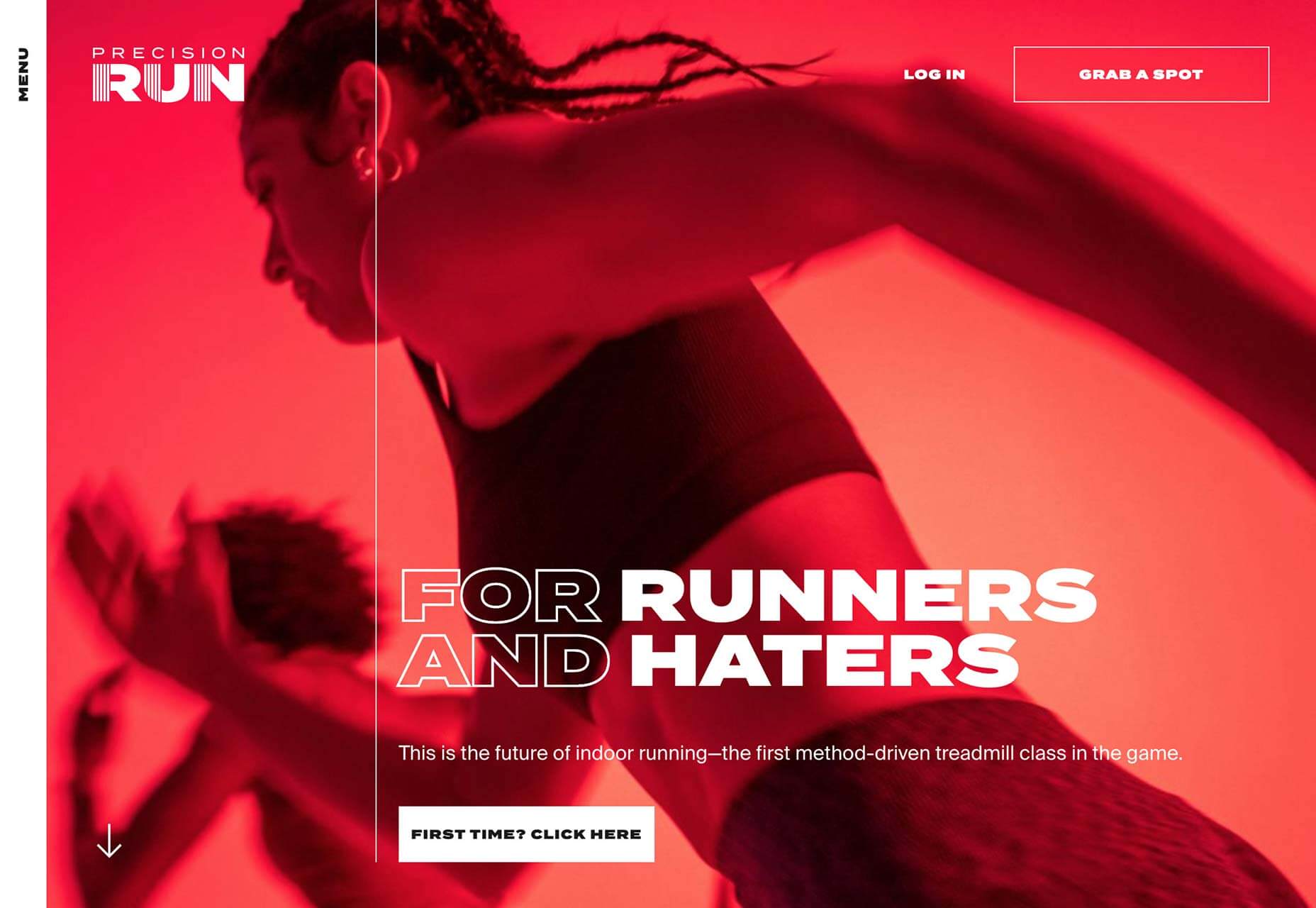
Precision Run
The indoor bike revolution has taken over the world, and what Peleton did for cycling, Precision Run wants to do for treadmill running. Its site is high-energy, with clever use of low-quality looped video, and bold typography.
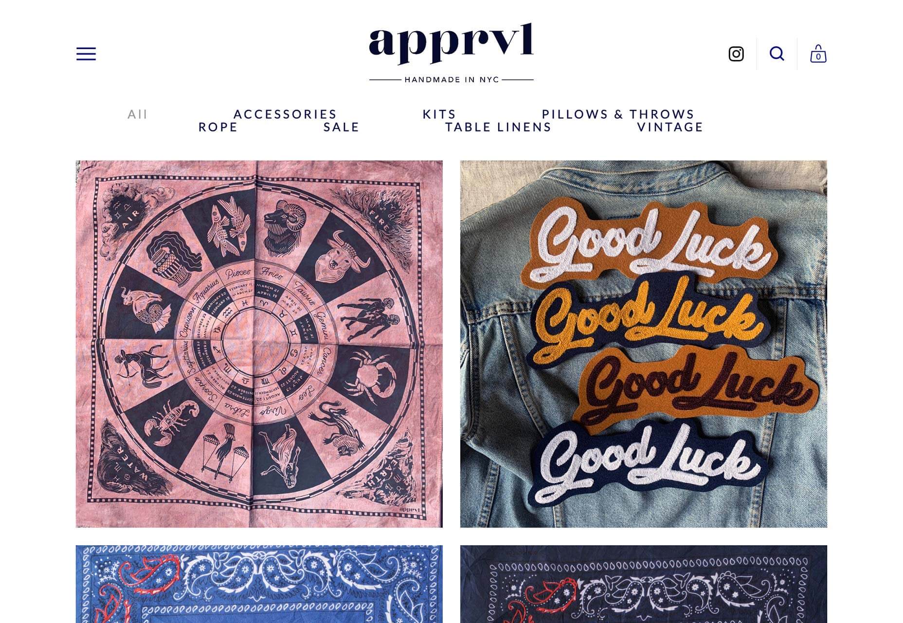
Apprvl
Apprvl is a collection of goods, handmade in New York. The site is a typical ecommerce store, with everything exactly where you’d expect it. The difference is the art direction, which transforms simple minimalism into a brand statement.
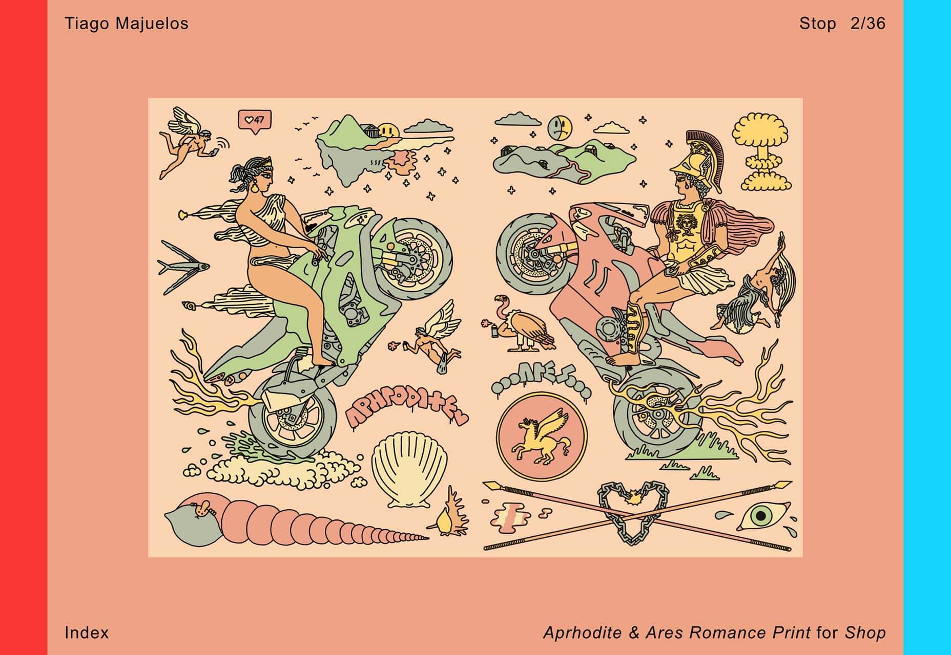
Tiago Majuelos
These colorful, energetic illustrations are the work of Tiago Majuelos, a Barcelona, Spain-based designer with a client list that includes Pull & Bear, Nike, and New York Times. The site is simple to use, but packed with delight.
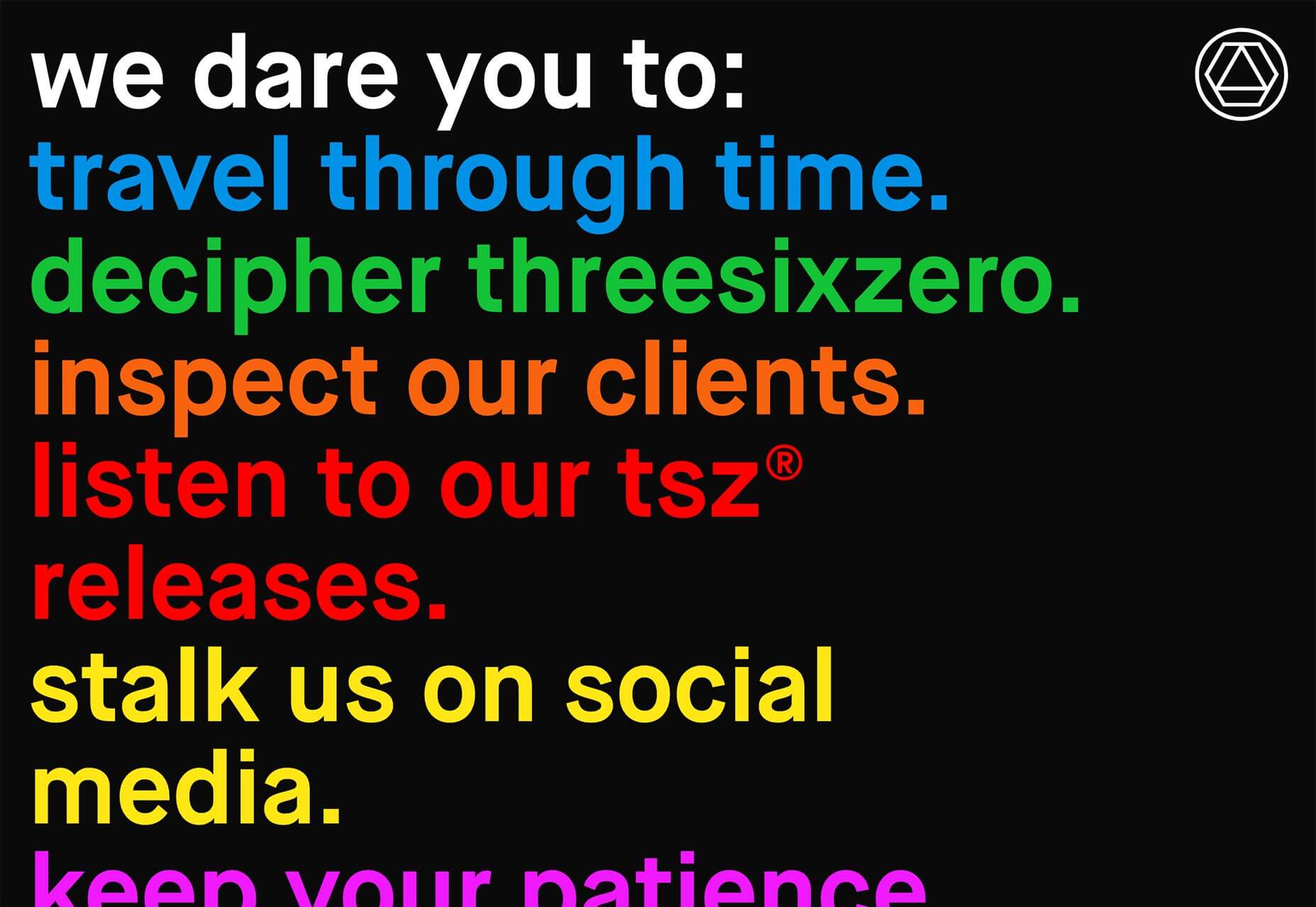
threesixzero
threesixzero is a global management company working with some of the biggest names in music and film. Its edgy site starts out enigmatic, but click around a little and the homepage menu will simplify itself.
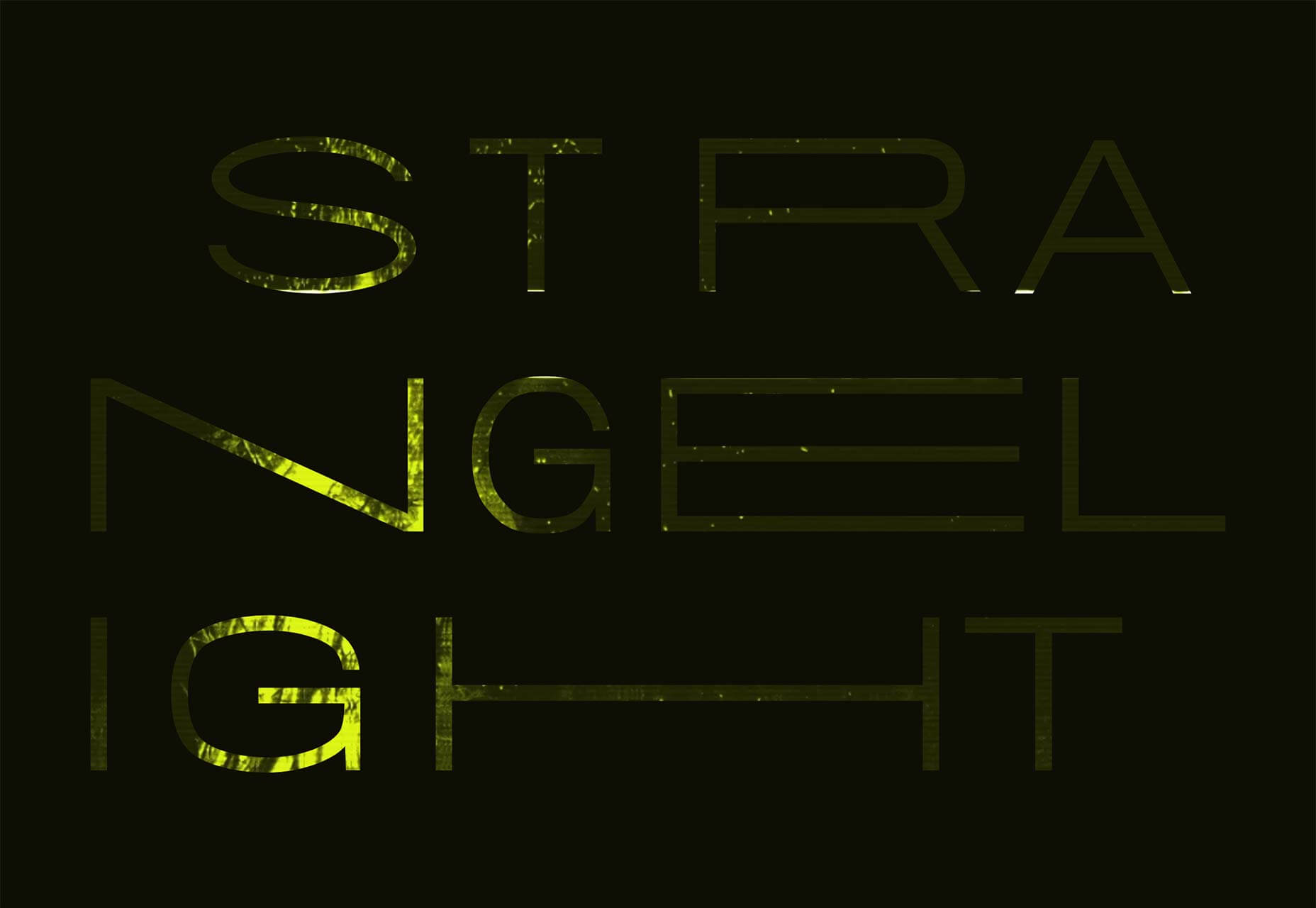
Strange Light
If you’re a fan of offbeat Canadian literature, then you’ll want to check out Strange Light. The site features some X Files level creepy graphics, all designed to introduce you to the publishing house’s stable of authors.
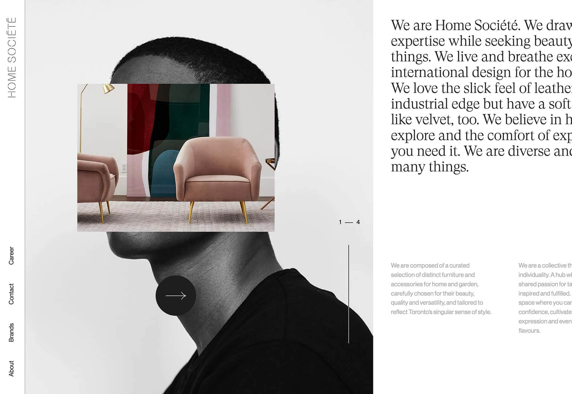
Home Société
Horizontal scrolling is often distracting, disorientating, and as a result is sometimes frowned on. But not in the case of this interiors site, which combines the lateral movement with an unexpected parallax style effect.
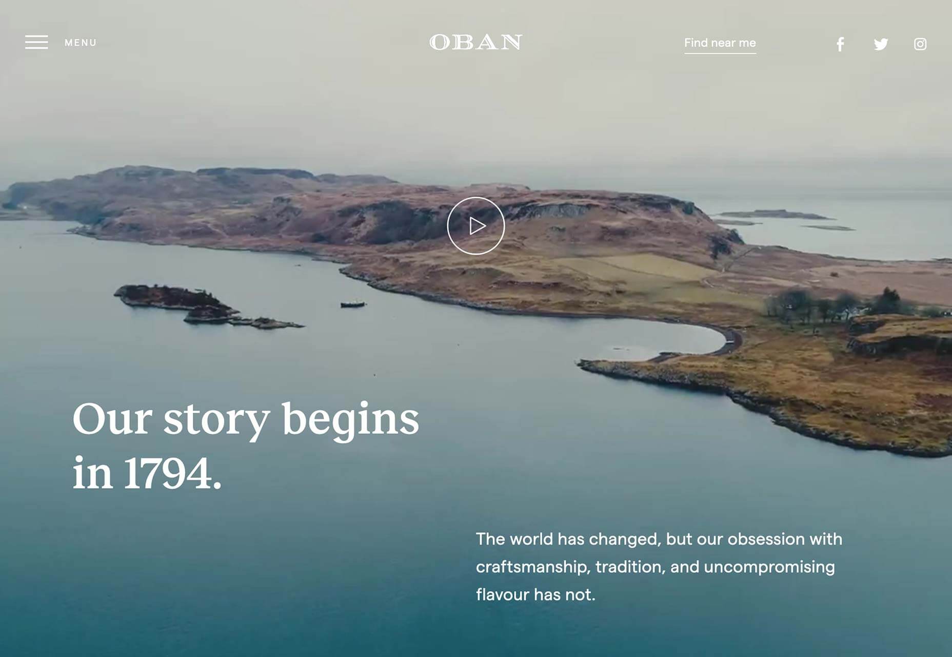
Oban Whisky
Oban Whisky is distilled in the small West Scotland town of Oban. Its site features a combination of superb modern typography, and video-heavy content that focuses on the heritage and traditions of the brand.
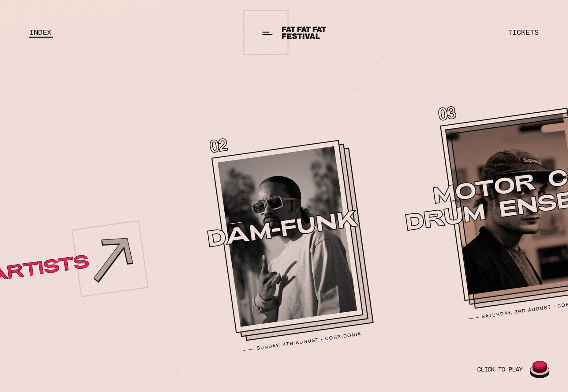
FAT FAT FAT Festival
FAT FAT FAT is an Italian music festival taking place in two different venues, from the 2nd to the 4th of August 2019. The site features brutalist animation, low-fi texture, and an addictive diagonal scroll for the artists on the homepage.
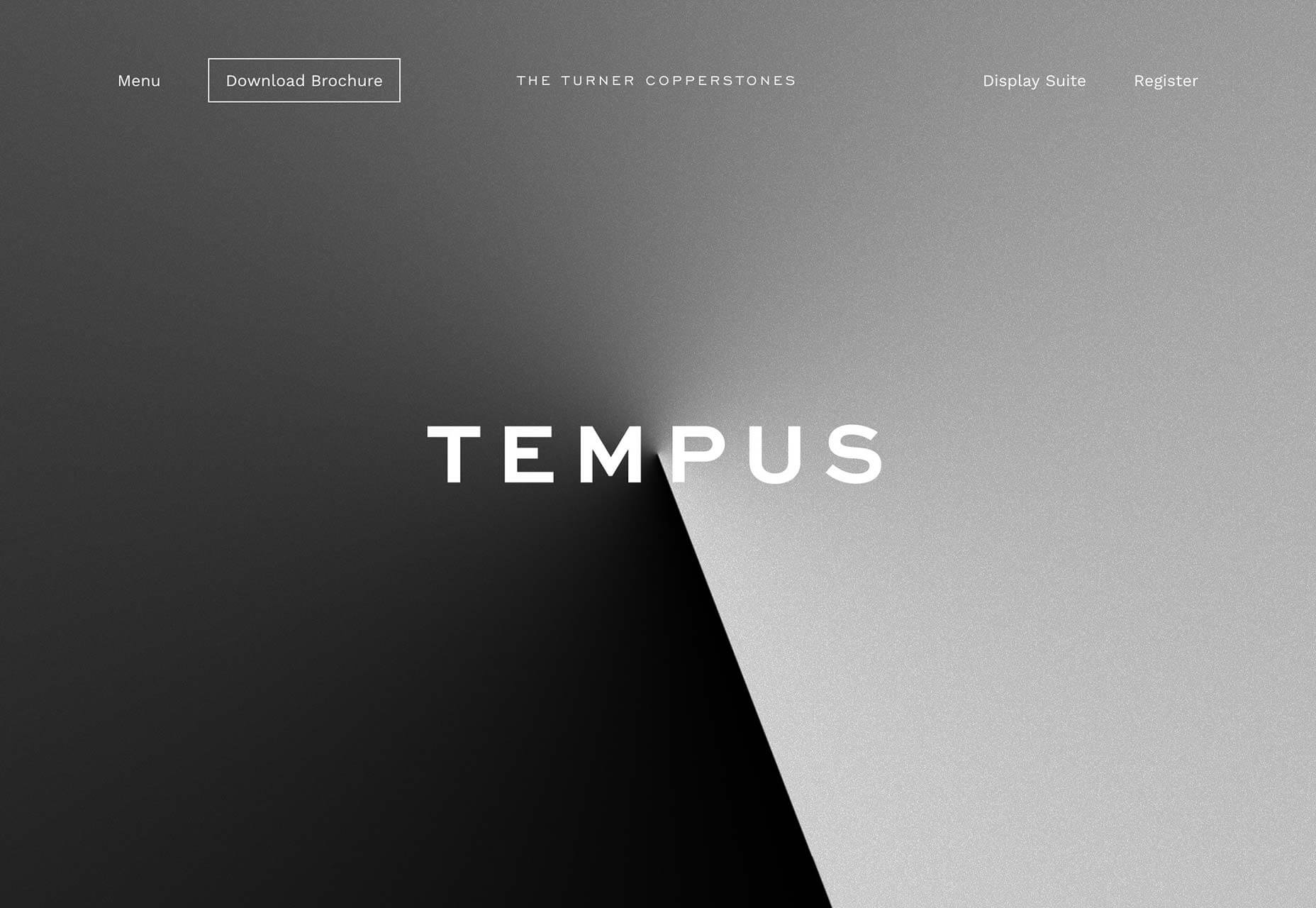
The Turner Copperstones
Opening with an intriguing gradient clock, this site for a planned group of townhouses situated in Australia, but inspired by New York, features a subtle grid that juxtaposes artist’s impressions, and the planned materials. I would definitely live here.
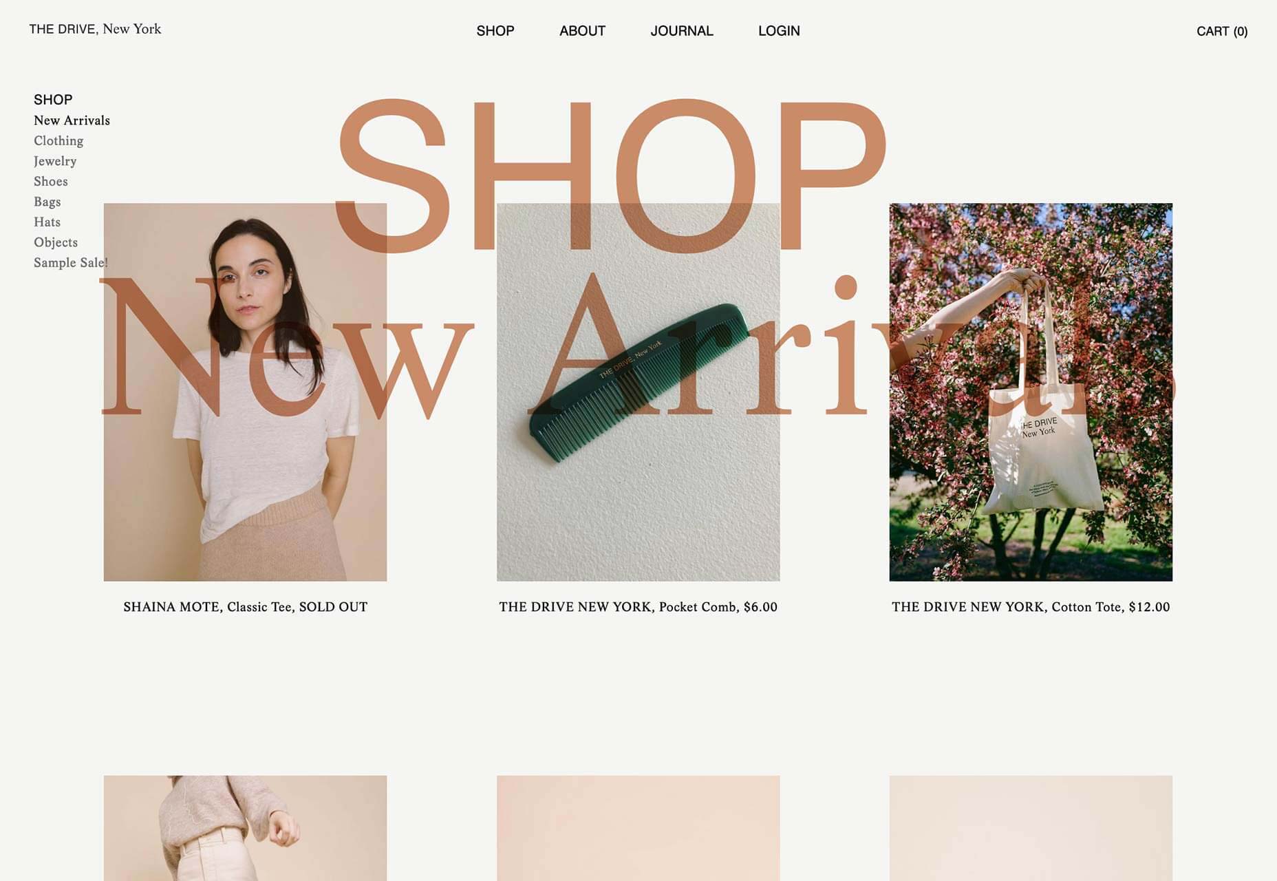
The Drive
The Drive is a Brooklyn-based shop and studio with a penchant for brown, which is a color super-difficult to pull off on screen. The caramel type interacting with the photography on the shop pages is brave.