During the Winter months it’s easy to get the blues, and let that show through in design work with darker color palettes and a slower paced feel to projects. But that’s not the way projects are trending right now.
Designers are embracing big, bold concepts with oversized elements, bright color, and even a little rule-breaking. (The best part? Most of these trends seem to overlap somewhat.) Here’s what’s trending in design this month.
Homepage Headline Heroes
Homepage hero areas are shifting again from website entryways with plenty of text, CTAs, and options for users, to simple displays with big headlines (and maybe not much else).
Use of oversized headlines and text elements make it clear from the start what a website or design is about, but doesn’t provide a lot of opportunity for users to explore without scrolling. And that might be okay. Thanks to mobile dominance, users have become accustomed to the scroll. It may even be shifting to the preferred method of digesting content. (Even more than clicks or taps.)
Scroll is fast and allows users to glance at content and information with little delay or interaction.
Each of the website examples below are designed for just that:
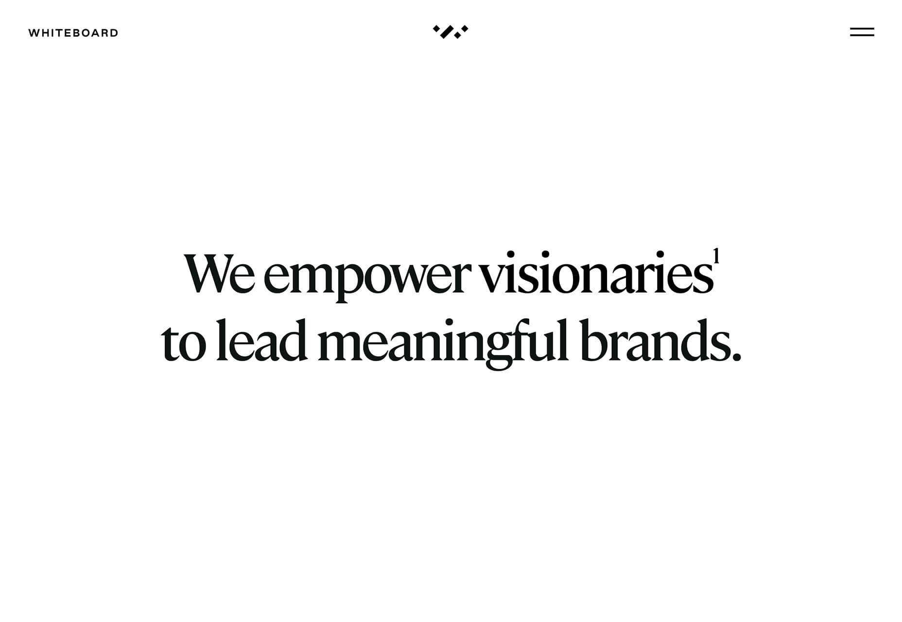
Whiteboard opens with a large headline that encompasses their vision statement and nothing else. On scroll you get access to projects and a deeper dive into information about the brand.
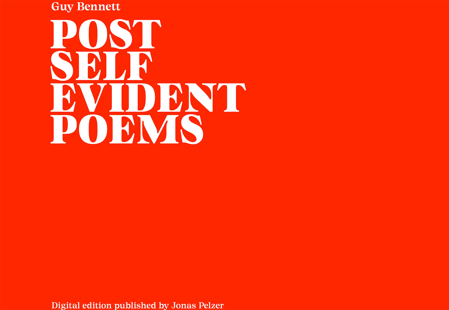
Self-Evident Poems doesn’t actually scroll but moves into prompts for usability. It’s rooted in the same homepage headline hero area that’s designed to draw you into the content.
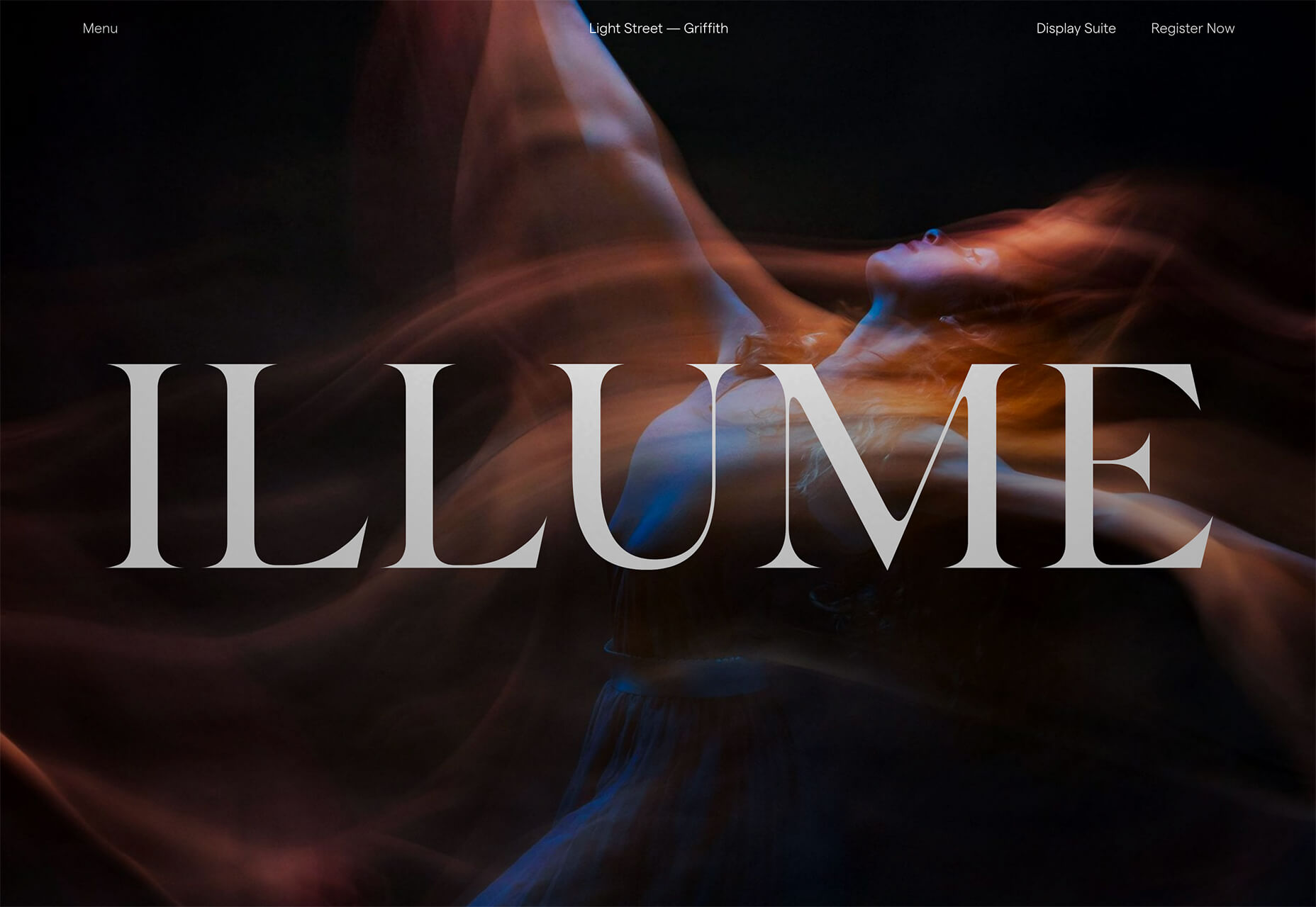
Illume has additional content below the scroll beneath a giant headline in the hero area. What this design does differently is that it does include some imagery, although it is still secondary to the text because of typography size.
Peachy Tones
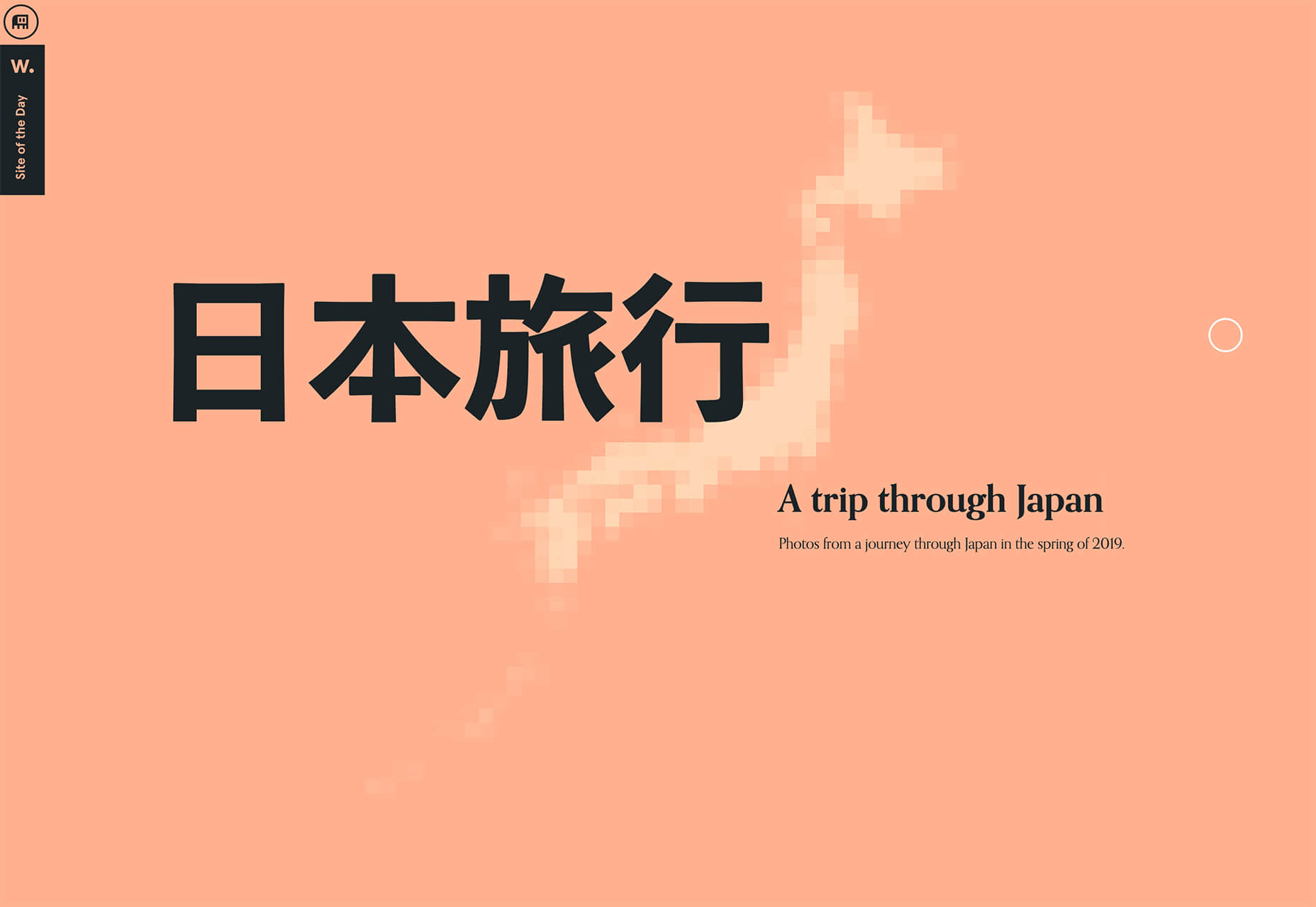
Beat the Winter blues with a dose of Spring color! Peachy tones seem to be everywhere.
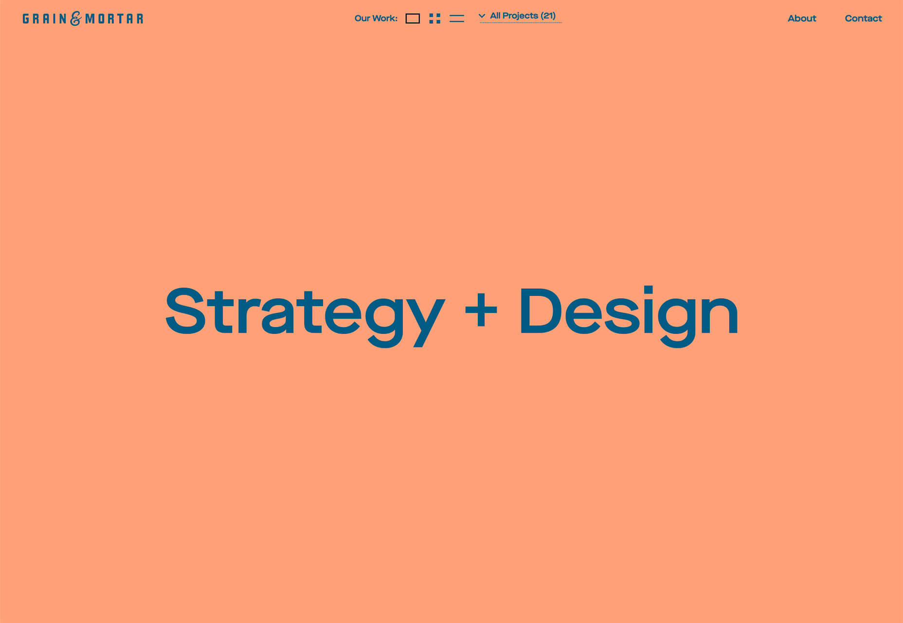
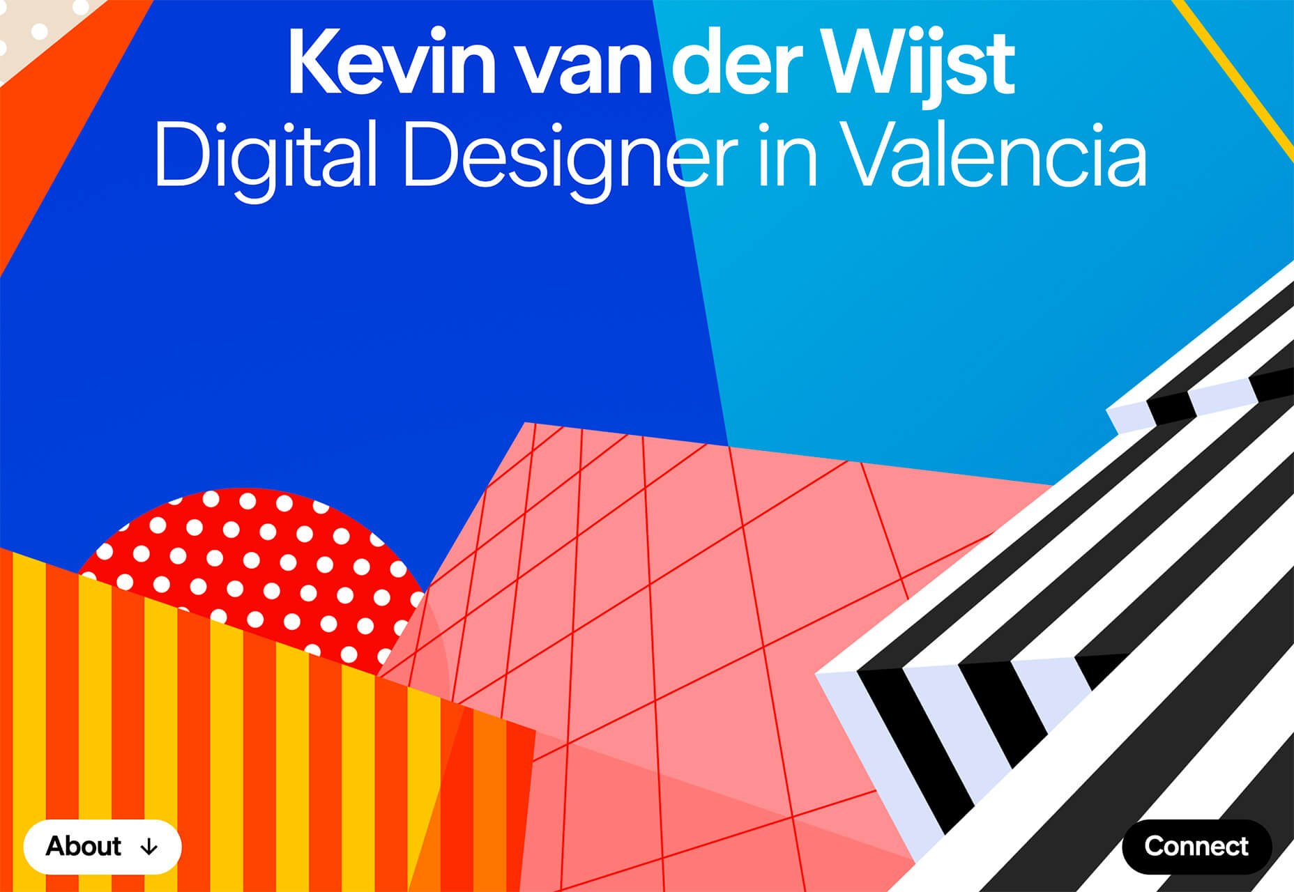
While this trend might be an evolution from other bright colors such as pinks and oranges that have been popular, it has a lot of practical application. Use it as a dominant color such as Grain & Mortar, and Monokai, or to create an accent like Kevin van der Wijst’s portfolio.
Peachy tones provide plenty of options and can be more pinkish or push toward orange. The color can be highly saturated or fairly pale. The nice thing about peachy tones is that they aren’t that overpowering, and work equally well as background or foreground color. Peach can get a little tricky when used for typographic elements, depending on the font style and contrasting elements.
Larger swaths of peach tend to stand up against other elements better than tiny ones. Note that even as an accent in the featured portfolio below, peach tones encompass a significant portion of the canvas. (You might also want to click through and play with that design, which also includes cool liquid animation. You can even make the peach area take up most of the screen.)
Outline Fonts
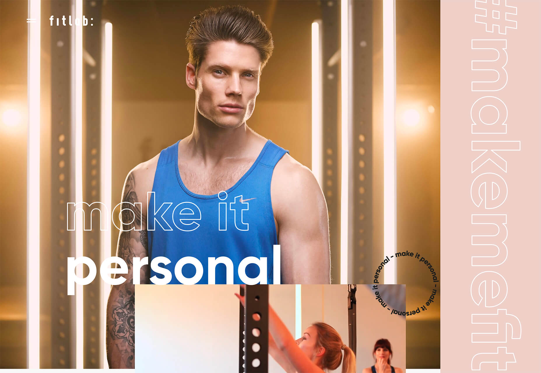
This trend is exploding in use from small projects to big brands. Outline fonts are a big deal. It’s one of those trends that you would shake your head at and say “no way” if you didn’t see it in action … and used so well.
Outline fonts can be a challenge. They create an effect that’s almost the opposite of the oversized typography in another trend mentioned here. But they do create an eye-catching effect that draws you into the words on screen.
Outline fonts are almost always paired with the same font filled. It creates and yin and yang effect that can help keep users reading longer and engaging with content. The contrast between and outline and filled font also put specific emphasis on the bolder element in the lettering pair.
The trick to making it work is not to get too crazy with the design and design outline fonts so that there’s plenty of contrast for the letters to remain readable.
Fitlab is the busiest of the examples of this trend with multiple use of outline fonts and even a quick-moving video roll. Put it all together and the emphasis is on “personal” training. It works.
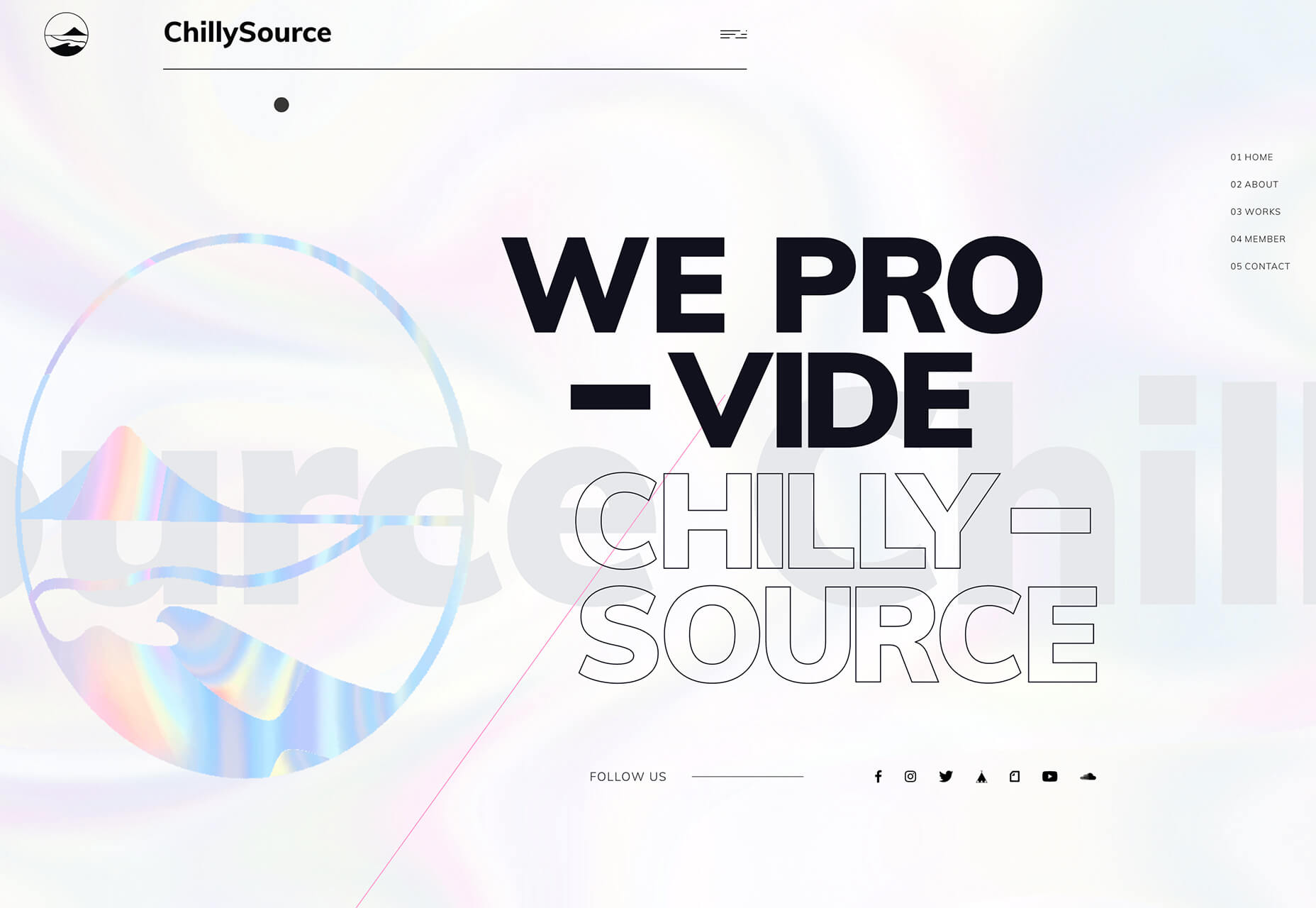
Chilly Source uses an outline font for its brand name so that you get another intro to it without too much brand in your face. (The name is mentioned three time on the homepage.)
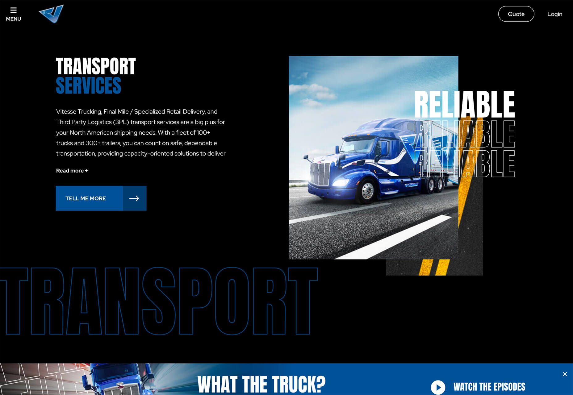
Vitesse Trucking uses outline text to tell you what they do throughout the design. Text is information but also serves as an art element with movement in the parallax-style scrolling design. Outline type elements mirror smaller filled words and even include some layering and overlays to keep the eyes moving. It’s an interesting use of this trend in an industry where you might not expect it.
Conclusion
I’ll be the first to admit, you probably won’t find me designing with a lot of peachy coloring. While it works for these projects, it’s not a favorite of mine.
On the flip side, I adore all the outline font options. It’s funky and provides depth to text elements that we haven’t seen a lot of. How about you? What design trends can you see yourself using in the coming months?


